

How design systems teams are using AI tools
Plus examples from Cursor, Ramp, Notion

👋 Get weekly insights, tools, and templates to help you build and scale design systems. More: Design Tokens Mastery Course / YouTube / My Linkedin
Your design system has a 3-week documentation lag. Components exist in code that don’t match Figma. Your design audit takes 6 hours every sprint. Meanwhile, teams with integrated AI workflows ship components in 2 hours instead of 2 days, maintain docs that update automatically, and run comprehensive audits in 5 minutes.
I want to share what design system teams can actually build and use today. 👇
The local environment advantage
Most teams prototype in Figma. Static pixels that lie about how things actually work. It’s time to start using real code in local environments and iterate in minutes, not days.
Why this matters: Figma can’t show you what happens when a user types 13 characters into your input field. Or what your loading state looks like after 3 seconds. Or how your modal behaves when someone mashes the escape key 12 times.
Better way:
Step 1: Set up your local sandbox
Next.js dev server running locally
Component library imported
Design tokens connected
Hot reload enabled
Step 2: Use AI to generate the component
Feed Claude or Cursor your Figma design (via Figma MCP)
Include your design token structure
Specify your component patterns
Get working code in 2 minutes
Step 3: Test with real interactions
Type actual content (not lorem ipsum)
Test keyboard navigation
Break things intentionally
Watch how it fails
Yes, you can reduce component development by at least 50%.
🙌 For a complete guide on AI component generation, see

If you want examples from Ramp, Notion and Cursor, check the video here:
Building with components, not from scratch
Your component library is your AI’s best friend.
Generate a data table using our existing design system components:
- Use our Button component for actions
- Use our Checkbox component for row selection
- Use our Dropdown component for filters
- Apply spacing tokens from our system
- Follow our responsive patterns

Component library location: /src/components
Design tokens: /src/tokens/core.json
This approach gives you:
Consistent patterns automatically
Faster development (reuse, not rebuild)
Components that already match your system
Less code to maintain
Team markdown files as AI context
The best design system teams document everything in markdown. Not for humans. For AI.
What to document (in short)
Design guidelines:
# Button Usage Guidelines

## When to use
- Primary actions on a page
- Form submissions
- Critical user decisions

## When NOT to use
- Navigation (use Link component)
- Toggles (use Switch component)
- Multiple options (use Dropdown)

## Accessibility requirements
- Minimum 44x44px touch target
- Clear focus indicators
- Descriptive labels (no “Click here”)
Component patterns:
# Form Validation Pattern

## Implementation
1. Validate on blur (not on every keystroke)
2. Show errors below the field
3. Use error color token: {color.feedback.error}
4. Include icon for visual reinforcement
5. Provide clear, actionable error messages

## Example error messages
❌ “Invalid input”
✅ “Email must include @ symbol”
Token usage rules:
# Spacing Token Usage

## Component spacing
- Use inset tokens for padding: spacing-inset-md
- Use stack tokens for vertical gaps: spacing-stack-sm
- Use inline tokens for horizontal gaps: spacing-inline-xs

## Never use
- Arbitrary values (no padding: 13px)
- Spacing tokens for border radius
- Stack tokens for horizontal spacing
Why this works
When you ask AI to build a component, it reads these files automatically (if you set up your context correctly). No copy-pasting guidelines. No explaining patterns every time.
When you write “Build a form with validation” → AI reads your validation pattern doc and implements it correctly.
Prompts library
Stop rewriting the same prompts. Build a prompt library for your team. If you need inspiration, here is my public one.
Example: Checklist for component
Figma Link - Direct design reference (use Figma MCP)
Inspiration - Reference designs from other systems
Design Specs - Exact spacing, colors, typography values
Design Tokens - Where tokens live and how to use them
Component Overview - Purpose, use cases, when to use
Component Variants - All states, sizes, types
Framework/Tech Stack - React version, TypeScript, dependencies
Component Architecture - File structure, naming conventions
Dependencies - What it needs to work
Task Context - Problem it solves, user needs
Interactions & Behavior - Animations, transitions, timing
Responsive Behavior - Breakpoints, mobile considerations
Accessibility Features - WCAG requirements, ARIA, keyboard nav
Demo - Expected output, usage examples
Documentation - Props, usage guidelines, do’s and don’ts
.ai/ Directory - Persistent guidelines for this component
Some examples:
Token validation prompt:
Audit this component for design token usage:
1. Identify all hardcoded values
2. Replace with appropriate tokens from /tokens/core.json
3. Verify semantic token usage matches guidelines in /docs/token-usage.md
4. Check color contrast ratios meet WCAG AA
5. List any missing tokens we need to add

Output: Before/after comparison with token replacements
Accessibility audit prompt:
Review this component for accessibility:
- WCAG 2.1 AA compliance
- Keyboard navigation (tab order, focus management)
- Screen reader support (ARIA labels, roles, live regions)
- Color contrast ratios
- Touch target sizes (minimum 44x44px)
- Focus indicators (visible and clear)

Reference: /docs/accessibility-guidelines.md
Output: Checklist with pass/fail and fixes needed
Documentation generator prompt:
Generate complete component documentation:
1. Overview and purpose
2. Props table (name, type, default, description)
3. Usage examples (basic, advanced, edge cases)
4. Accessibility notes
5. Do’s and don’ts with examples
6. Related components
7. Design token references

Format: Markdown
Style: Match existing docs in /docs/components/
Writing documentation and UX texts
Documentation lag kills design systems.
Automated approach:
Designer updates Figma
AI detects change via Figma API
AI updates documentation automatically
Docs deploy in real-time
Everyone works from current information
The complete guide for this setup is detailed in How to Automate Design System Documentation.
UX writing at scale
AI excels at generating consistent UX copy that matches your voice. You have more options here:
Build a project in Claude (with you favourite writing styles)
Build a Skill in Claude from your writing guidelines
Create a tone and voice guide markdown files for Cursor or Claude Code and then use them for consistent results
Use your custom GPT and add all the writing you like
Yep, now you get consistent voice. Zero meetings about “should this say ‘Delete’ or ‘Remove’?”
Building internal tools and plugins
Some examples
1. Design token name generator
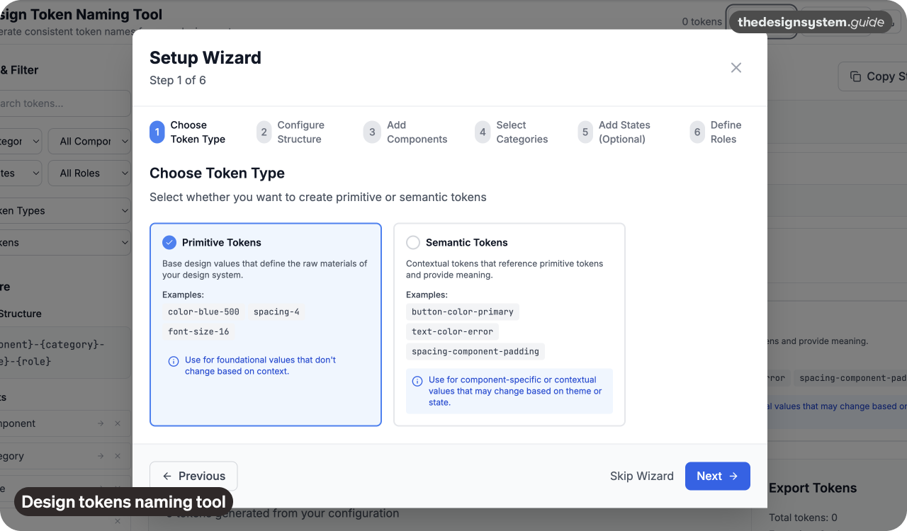
I built a web app that generates consistent token names following our naming convention. This playground helps immensely because everyone starts to understand how naming structure works.
Time saved: stopped counting :)))
2. Figma to code sync tool
An automated pipeline that:
Reads Figma component changes via API
Generates updated React components
Creates a pull request with changes
Runs visual regression tests
Notifies the team of updates
Result: Design-code drift went from 3 weeks to 3 minutes.
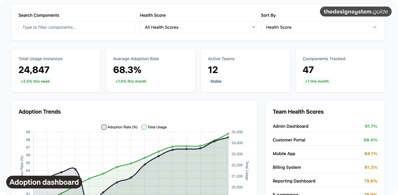
3. Component usage analyzer
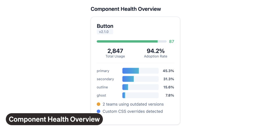
Script that scans your codebase and reports:
Which components are actually used
Adoption rate by team
Deprecated components still in use
Inconsistent implementations
Missing design tokens
Impact: Identified 40 unused components we could deprecate. Found 6 teams still using old patterns.
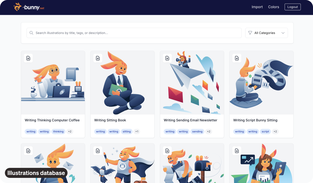
4. Illustration database
I connected bunny.net (for Storage via API), Vercel and built the database with all our .svg illustrations.
Design System Buddy
Chatbot connected that shares all the useful data about the design system.
The build-vs-buy decision
Build when:
It’s specific to your design system structure
You’ll use it weekly
It saves more than 2 hours per week
You can build it in under 8 hours
Buy when:
It’s a common problem (Storybook, Chromatic)
Building it would take weeks
Maintenance is complex
Support matters
Most internal tools fall into the “build” category. They’re simpler than you think, especially with AI helping you code.
Model Context Protocol (MCP) servers
MCP is the technology that changes everything. It gives AI direct access to external tools. The biggest benefit is that the data is always accurate and latest.


Some ideas for MCP connections for design systems
1. Figma MCP
Read design files directly
Extract component specs
Pull design tokens
Generate code from designs
2. GitHub MCP
Review component code
Check token usage
Track design system changes
Automate pull requests
3. Documentation MCP
Search your docs instantly
Verify information is current
Generate new documentation
Update existing content
4. Analytics MCP
Component adoption metrics
Usage patterns
Performance data
Team adoption rates
Testing user interactions
Playwright
I use Playwright to automate design audits that used to take 3 hours. Now they run in minutes.

Connect to actual APIs
Static designs with fake data hide problems. Real data reveals them.
Product data:
Connect your components to real product catalogs. Test how your card layouts handle products with 200-character descriptions versus 20. See how pricing displays for items under $1 versus over $10,000. Real product data reveals layout breaks, text overflow issues, and edge cases you’d never consider with lorem ipsum.
User data:
Pull actual user profiles from your database. Test components with users who have no profile photos, names with 40+ characters, special characters in their names, or right-to-left scripts. Discover that 23% of your users need empty state handling you didn’t design for. Real user data forces you to design for diversity, not just “John Smith.”
Analytics data:
Connect to PostHog or Mixpanel to see which component variants are actually used in production. Track which buttons get clicked, which empty states are most common, and which error messages users see most often. Use this data to prioritize component improvements based on real usage, not assumptions. One team discovered they spent months perfecting a component variant that represented less than 2% of actual usage.
Claude Code skills for design systems
Claude Skills are specialized, reusable workflows that load context only when needed. They’re deterministic, not LLM-guessing.
Making AI tools work for your team
🙌 Start with your biggest bottleneck
Don’t try to optimize everything. Pick the one thing that wastes the most time.
🙌 Build incrementally
Week 1: Set up local development environment with component sandbox
Week 2: Create markdown guidelines and shared prompt library
Week 3: Build one internal tool (token validator or documentation generator)
Week 4: Set up MCP server for design tokens
Week 5: Implement automated testing for core components
Each week builds on the previous. You see value immediately while working toward full automation.
🙌 Measure what matters
Track these metrics to prove AI integration value:
Development velocity
Quality consistency
Time savings
Team adoption
Soooo, as you can see, the difference is C O N T E X T. The teams winning with AI have built systems where AI has direct access to design tokens (via MCP), component patterns (via markdown docs), usage guidelines (via team documentation), real data (via API connections), and testing infrastructure (via Playwright).
The goal isn’t perfect AI integration. The goal is eliminating the manual work that kills your team’s momentum.
YOU GOT THIS. 🙌
Romina
More helpful links

Figma MCP - Model Context Protocol server for Figma integration
Claude Desktop - Desktop app required for MCP servers
Playwright - Browser automation for testing
Mintlify - Documentation platform with auto-deployment
Style Dictionary - Token transformation tool
Storybook - Component development and documentation
Chromatic - Visual regression testing
Claude Skills Documentation - Building specialized AI workflows
— If you enjoyed this post, please tap the Like button below 💛 This helps me see what you want to read. Thank you.
💎 Community Gems
✨ Agentic Design System Course
Waitlist opened. 😊
🔗 Link
Gamma AI
AI tool for making presentations.
🔗 Link
Nice! Thanks for sharing 👌
The internal tools you built look so helpful, especially the design token name generator.