

The Ultimate AI Component Generation Framework
16 steps to go from messy prompts to usable components

👋 Get weekly insights, tools, and templates to help you build and scale design systems. More: Design Tokens Mastery Course / YouTube / My Linkedin
You’ve learned the basics of prompting. You know how to pick the right model. You know how to generate a basic prototype.
Now it’s time to go deeper.
After generating hundreds of components, I’ve developed a systematic framework that works effectively for me. Think of it as a checklist. Let’s go through👇
Figma Link (well, of course 😂)
Inspiration directory
Design Specs
Design Tokens
Component Overview
Component Variants
Framework/Tech Stack
Component Architecture
Dependencies
Task Context
Interactions & Behavior
Responsive Behavior
Accessibility Features
Demo
Documentation
.ai/ Directory
1 Figma Link
What to include: Direct URL to Figma frame or component
Why it matters: When using Figma MCP with tools like Cursor or Claude Code, this gives AI access to the actual design structure, not just a screenshot. The AI can read layers, extract spacing, identify components, and understand the visual hierarchy.
🟡 Without MCP:
Create a button component based on this screenshot [paste image]✅ With MCP:
Figma link: https://figma.com/file/abc123/Component?node-id=456

Generate a Button component matching the selected Figma frame.
Use MCP to extract exact spacing, colors, and typography values.
Getting MCP to work reliably can be frustrating at first. Here’s what I learned the hard way:
Selection matters MORE than you think. When you select a frame in Figma, MCP reads that exact selection. But here’s the trick: if your component uses nested components from your library, MCP might not fetch those dependencies. I learned to either:
Select the PARENT frame that includes everything needed
Or write: “Also fetch the Icon and Button components that are nested here”
Name your layers in Figma. This alone improved my results by 30%.
Use Figma variables (design tokens) religiously. When you use Figma variables for colors/spacing, MCP extracts them perfectly. Hardcoded values in Figma? The AI has to guess.
When MCP fails: Keep Cursor open, restart only Figma, re-select the frame. If still broken, restart both. Never waste 20 minutes debugging, just restart.
2 Inspiration
What to include: Links to similar designs, competitor examples, or design patterns
Why it matters: This gives AI visual context for style and interaction patterns without requiring exact recreation.
Example:
Inspiration:
- Stripe’s payment button: https://stripe.com/docs/payments
- Notion’s hover cards: https://notion.so

Style reference: Clean, minimal, focus on functionality over decoration

Interaction pattern:
- add details
I keep a /inspiration folder in my project with annotated screenshots
/inspiration/
    website-x.png
    notion-header.png
When you need something, you call it /inspiration/website-x.png Be very specific in describing what you like in that screenshot.
3 Design Specs
What to include: Specific visual properties
❌ Bad spec: ‘make it blue’”
✅ Good spec: ‘color: var(--color-primary-600, #2563EB), applies to background in default state, changes to --color-primary-700 on hover”
Option 1: Copy your specs
Design Specs:

Colors:
- Background: #3B82F6 (primary), #FFFFFF (secondary)
- Text: #FFFFFF (primary buttons), #1F2937 (secondary buttons)
- Border: #E5E7EB (1px)
- Focus ring: #3B82F6 with 2px offset

Typography:
- Font family: Inter
- Font size: 14px (small), 16px (medium), 18px (large)
- Font weight: 500 (medium), 600 (semibold for primary)
- Line height: 1.5

Spacing:
- Padding: 8px 16px (small), 12px 24px (medium), 16px 32px (large)
- Gap between icon and text: 8px
- Minimum height: 32px (small), 40px (medium), 48px (large)

Visual effects:
- Border radius: 6px
- Box shadow: 0 1px 2px rgba(0,0,0,0.05)
- Hover: darken by 10%, lift shadow to 0 2px 4px rgba(0,0,0,0.1)
- Transition: all 150ms ease
Option 2: instruct Cursor to take them from Figma (via Figma MCP or API)
Option 3: Connect your GitHub repository
4 Design Tokens
What to include: Where tokens are stored, how to reference them, theme switching requirements
Example:
Design Tokens:

Token structure:
- Repository: /src/tokens/
- Format: JSON with three tiers (primitive, semantic, component)
- Import: import tokens from ‘@/tokens’

Color modes:
- Light mode (default)
- Dark mode (toggle via data-theme=”dark” on body)
- High contrast mode (WCAG AAA)

Token locations:
- Figma variables: Use Figma MCP to extract
- Code repository: /src/tokens/colors.json, /src/tokens/spacing.json
- Token naming: Use dot notation (color.primary.default, spacing.4)

Theme switching:
- Component should respond to CSS custom properties
- Use var(--color-primary) not hardcoded values
- Test with all three color modes
Dark mode
If you have dark mode, create a separate set of prompts or a context file:
# Dark Mode (.ai/dark-mode-context.md)

All components MUST support dark mode via CSS custom properties.

Implementation:
1. Never hardcode colors
2. Use var(--color-name) syntax
3. Test with data-theme=”light” and data-theme=”dark”
Token behavior in dark mode:
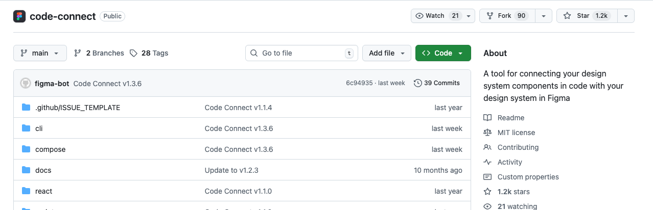
Code Connect
Code Connect is a tool for connecting your design system components in code with your design system in Figma. When using Code Connect, Figma’s Dev Mode will display true-to-production code snippets from your design system instead of autogenerated code examples. Code Connect is easy to set up, easy to maintain, type-safe, and extensible. Out of the box, Code Connect supports React (and React Native), Storybook, HTML (e.g., Web Components, Angular, and Vue), SwiftUI, and Jetpack Compose.
Before Code Connect + GitHub:
Token extraction: 5-10 minutes per component
Tokens often outdated (Figma changed, code didn’t)
Manual mapping (error-prone)
get_codetool failed, fell back to images (60% accuracy)
After Code Connect + GitHub:
Token reference: Instant (files already exist)
Always in sync (auto-updates)
Perfect mapping (bidirectional)
get_codetool works (returns actual code, 95% accuracy)
⚡️ PS. You need an Organization or Enterprise plan.
If you don’t have it:
Connect Cursor/Claude Code with your GitHub repository
Store in
.ai/design-tokens.jsonor in your project file
5 Component Overview
What to include: Component type, name, and application context
Component Overview:

Type: Interactive button component
Name: Button
Context: Used throughout app for primary actions, form submissions,
navigation triggers. Appears in forms, modals, cards, and navigation bars.

Related components:
- IconButton (variant with icon only)
- and so on

Critical use case: Checkout button must prevent double-clicks during payment processing.
The more context you give about HOW and WHERE the component is used, the better decisions Claude makes about props, states, and edge cases.
6 Component Variants
What to include: All variations by size, style, and state
Component Variants:

Size Variations:
- small: 32px height, 14px text
- medium (default): 40px height, 16px text
- large: 48px height, 18px text

Style Variants:
- primary: Solid fill, high contrast (main actions)
- secondary: Outline style (alternative actions)
- tertiary: Text only (low priority actions)
- ghost: Transparent, subtle (navigation items)
- destructive: Red styling (delete, remove actions)

State Variants:
- default: Base appearance
- hover: Darkened background, lifted shadow
- and so on ...
🚨 Build screens in STAGES, not all at once. First make components, then combine them into patterns, then into screens.
This staged approach gives me 95% success rate vs. 60% when I try to generate everything at once.
7 Framework/Tech Stack
What to include: Exact versions, styling approach, specific libraries
Framework/Tech Stack:

Core:
- Next.js 14 + React 18 + TypeScript 5.3
- Strict mode enabled
- Server components where possible, “use client” only when needed

Styling:
- Tailwind CSS 3.4 (utility classes only, no custom CSS)
- CSS Modules for complex animations (only if Tailwind insufficient)
- NO styled-components, NO emotion, NO inline styles

State Management:
- useState for simple state
- useReducer for complex state (forms with validation)
- No Redux, no Zustand at component level

Testing:
- Vitest + Testing Library
- 100% coverage for public API
- Accessibility tests with jest-axe
Version numbers matter MORE than you think.
❌ Bad: “Use React”
✅ Good: “Use React 18.2+ with functional components and hooks”
My workflow: Generate initial component in Claude Code, iterate and refine in Cursor.
💡 Model pricing update: Keep in mind that Claude Opus 4 and Sonnet 4.0 are 2x more expensive than previous versions. This week, Anthropic launched Sonnet 4.5, and the results are impressive. I’m still testing the details, but the model is actually cheaper while performing better. Early tests show it handles complex component generation even better than Opus 4 for most use cases.
8 Component Architecture
What to include: Whether it’s standalone, part of a system, or has dependencies
Structure:

Dependencies:

Used by:

Composition rules:

File structure:
File structure MUST be saved, or Claude invents its own. 🫠 I suggest you create a .ai/file-structure-template.md:
9 Dependencies
What to include: External libraries, internal components, system dependencies
shadcn/ui components:
- Use @/components/ui/button (already exists)
- Use @/components/ui/tooltip for hover info
- DO NOT recreate these, import them

If you need a component not in this list, FLAG IT and ask for approval.

External libraries:
- framer-motion for animations (only if specified)

Internal components:

System requirements:
- Node 18+
10 Task Context
What to include: What it does, where it lives, related components, user story, problem it solves
What you’re building:
A reusable button component that serves as the foundation for all
clickable actions in the application.

What this component does:
- describe

Where it lives in the app:
- Primary CTAs: “Sign Up”, “Buy Now”, “Submit”
- and so on

Related components:
- describe

Why it’s needed:
User story: As a user, I need clear, accessible buttons that
respond to my interactions with loading states and proper feedback.

Problem it solves:
🙌 Copy this template for task context:
Task Context:

The one-liner: [What this component does in 10 words]

Where it’s used (top 5 locations):
1. [Location]: [Specific usage]


Real-world example: [Detailed flow of ONE use case]

Edge cases discovered in that example:
- [Edge case 1]


Current problems (why we’re building this):
- [Problem 1]


Future usage (components that will consume this):
- [Component 1]: [How it will use it]
11 Interactions & Behavior
What to include: Interactive states, animations, transitions, and user interactions
Interactions & Behavior:

Interactive States:

Animations/Transitions:

User Interactions:

Edge cases:
Animation timing values are also important. Be specific:
Timing:
- State transitions: 150ms ease-in-out
- Micro-interactions (clicks): 50ms ease-out
- DO NOT use timing slower than 200ms (feels sluggish)
- and so on :)
12 Responsive Behavior
What to include: Breakpoints, responsive adaptations, mobile considerations
Responsive Behavior:

Breakpoints:
- Mobile: < 640px
- Tablet: 640px - 1024px
- Desktop: > 1024px

Responsive Adaptations:


Mobile (< 640px):
- Minimum touch target: 44x44px (even if visual smaller)
- describe


Tablet (640px - 1024px):
- describe

Desktop (> 1024px):
- describe

Responsive props:
- describe

Testing requirements:
- describe
13 Accessibility Features
What to include: ARIA attributes, keyboard navigation, screen reader support, and visual accessibility
Accessibility is where most AI-generated components fail. Claude knows A11y theory but often generates code that fails basic tests. I learned to be paranoid and explicit.
❌ DON’T let AI do this:
- <div onClick> without role=”button” and keyboard handlers
- disabled without aria-disabled
- Icon-only buttons without aria-label
- Focus styles that are “outline: none” only

✅ DO enforce this:
- Semantic HTML (<button>, not <div>)
- Both disabled AND aria-disabled=”true”
- aria-label on all icon-only buttons
- Visible focus indicator (never remove without replacement)
14 Demo
What to include: Description of expected output, working examples, variant previews, usage docs
Expected Output:
A fully functional Button component with all variants, states, and documentation.

Deliverables:
1. Button.tsx - Main component implementation
2. Button.test.tsx - Comprehensive test suite (>95% coverage)
3. Button.stories.tsx - Storybook stories showing all variants
4. README.md - Usage documentation with examples

Working component requirements:
- Storybook stories render correctly
- etc.

Variant previews needed in Storybook:
- All size variations (small, medium, large)
- etc.

Token/Style preview:
- Show component with light theme
- Show component with dark theme
- Show with high contrast theme
- Display token values used in Storybook docs

Usage documentation:
(Describe what you expect)
15 Documentation
Include Props
+ Type
+ Default
+ Description

Sizes
[When to use each size]

Styles
[When to use each style]

Variants

Do and Dont’s
✅ DO: [Good pattern] ❌ DON’T: [Anti-pattern]
16 Create a directory
Every AI tool (Cursor, Claude Code, Windsurf) reads files in .ai/ the directory. Put your guidelines here, and you will never have to repeat them in prompts.
Create
.ai/directory at project rootTell AI tools always to read it:
In Cursor settings (cursor_rules):
Before generating any component, read and follow rules in:
- .ai/design-system-foundation.md
- .ai/file-structure-template.md
In Claude Code, start every session:
Load context from .ai/ directory and follow all rules there.Ohhh, and we are done 👏
What’s Coming Next Week
I’ll show you how I wire these components into patterns and full mockups
Until next time, ⚡️
Romina
— If you enjoyed this post, please tap the Like button below 💛 Thank you.
💎 Community Gems
✨ Pencil.dev (just launched)
Design mode for Cursor
🔗 Link
In the economy of user effort, be a bargain, not a scam
Lea Verou
🔗 Link
Supernova 3.0
Announcing our Series A and the future of product development
🔗 Link
Wow! Thank you for your experience! I have an one question about variables in Figma. How to make friends Figma variables and AI? Have you done something with this? Maybe I’ve missed this in your article 🙈
Amazing! So much knowledge 🚀