

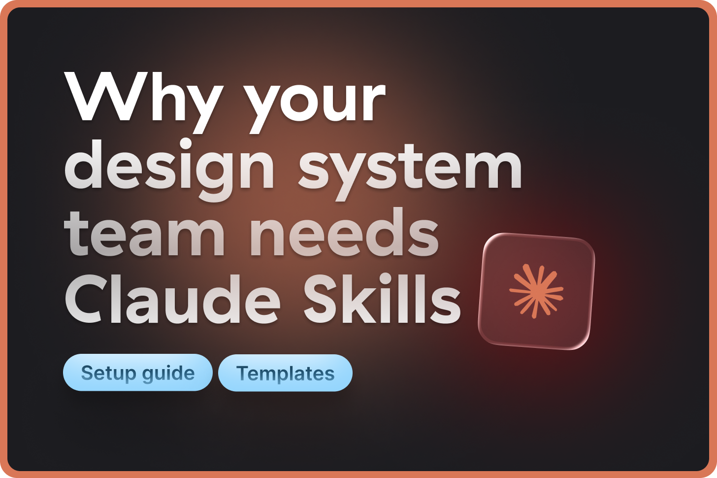
Why your design system team need Claude Skills
Setup guide with useful templates and examples

👋 Get weekly insights, tools, and templates to help you build and scale design systems. More: Design Tokens Mastery Course / YouTube / My Linkedin
I’m not affiliated with or sponsored by any companies mentioned. Everything shared here is based on what I’ve learned and tested firsthand.
You explain your token architecture to Claude.
Next conversation? You explain it again from scratch.
You ask Claude to sync tokens to Airtable.
Ten minutes of back-and-forth explaining your structure. Every. Single. Time.
Now you don’t have to repeat yourself anymore, because Claude introduced Skills. Skills remember the way you work, your calculations, can load context whenever needed, and act like your assistant.
What you’ll learn in this article:
Why Claude Skills solves the “context pollution” problem that makes AI hallucinate data
How Skills differ from Projects and Sub-Agents (and when to use each)
Three design system use cases: token validation, accessibility audits, and documentation generation
How to combine Skills with MCP servers for external tool access
How to build your first design system Skill in minutes
What are Claude Skills?
A Skill is a markdown file (or more of them) that teaches Claude how to do something specific, plus optional scripts and reference files.
You can use them across Claude apps, Claude Code, and our API.
Skills are available to Pro, Max, Team, and Enterprise users.
What makes Skills different:
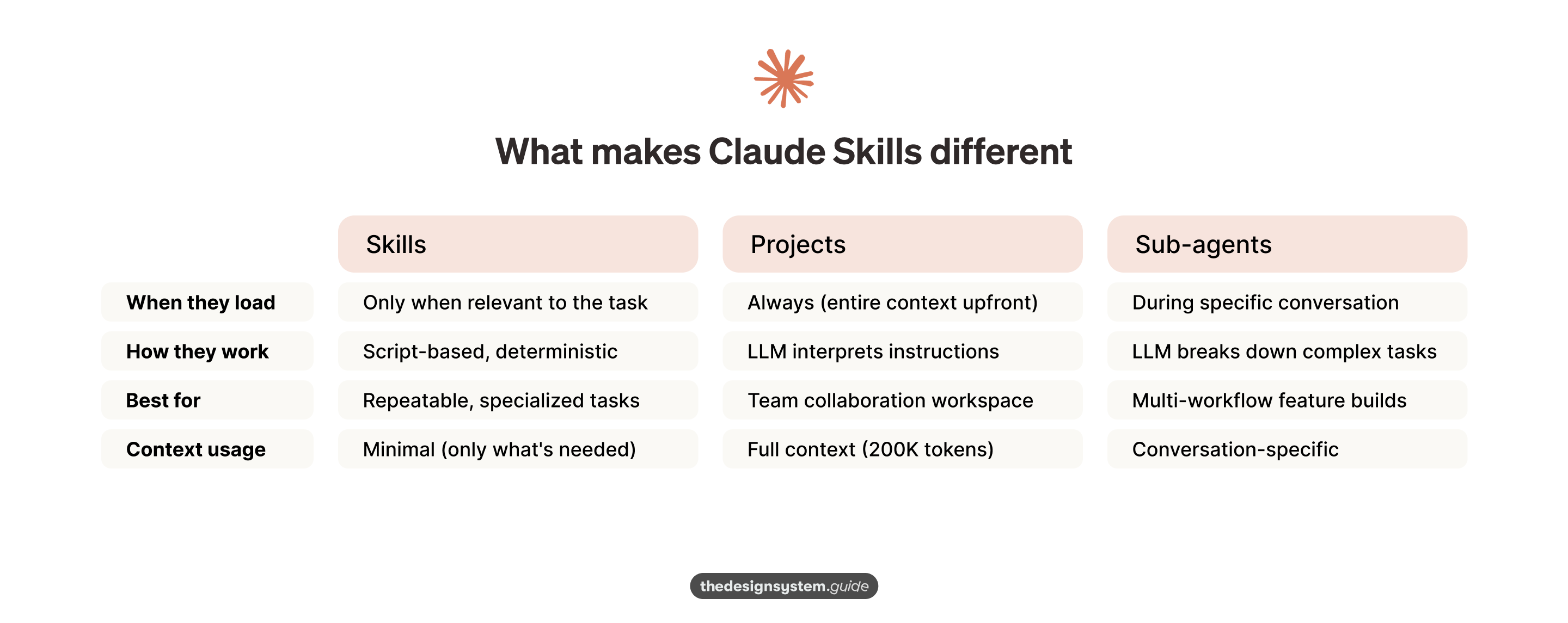
This matters because of something researchers call “context pollution.” When you load too much information into an AI conversation, performance degrades and hallucinations increase.
Skills solve this by loading context ONLY when needed for the specific task.
🙌 One simple example. Imagine you ask Claude to audit your component library for accessibility issues. You can’t rely on the LLM to “interpret” what to do. You need deterministic scripts that run the same way every time.
Skills let you combine:
Claude’s intelligence (understanding context and user intent)
Python/JavaScript scripts (accurate, repeatable calculations)
Your domain expertise (design system rules and constraints)
Skills vs Projects
You might be thinking: “Can’t I just use Claude Projects with custom instructions?”
Skills are for workflows. Projects are for contexts.
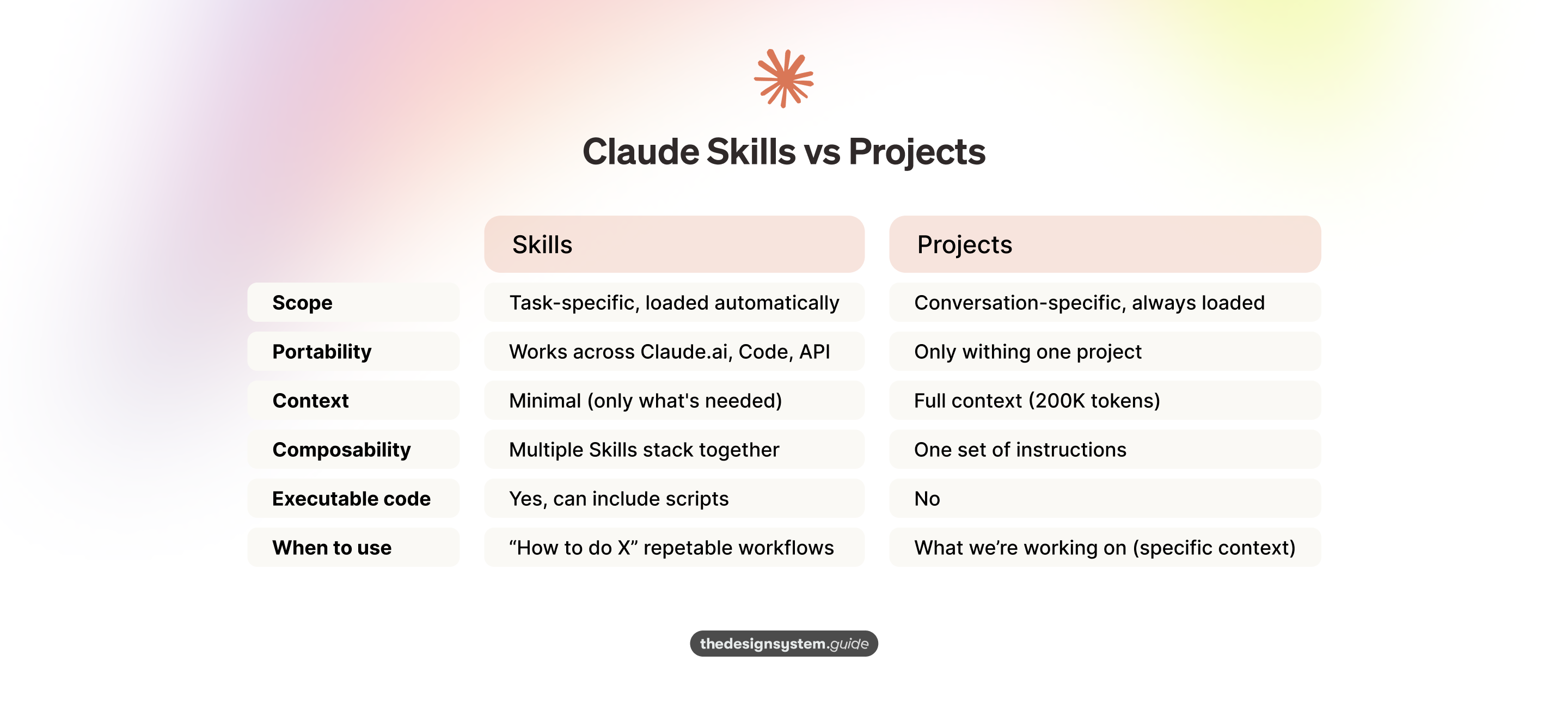
Use Skills for “how to audit components, sync tokens, write docs.”
Use Projects for “what we’re working on: redesigning checkout, migrating tokens.”
They complement each other. A Project might use multiple Skills automatically.
Five design system Skills you can build today
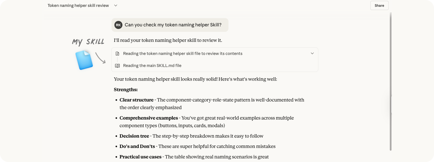
1. Design token naming helper
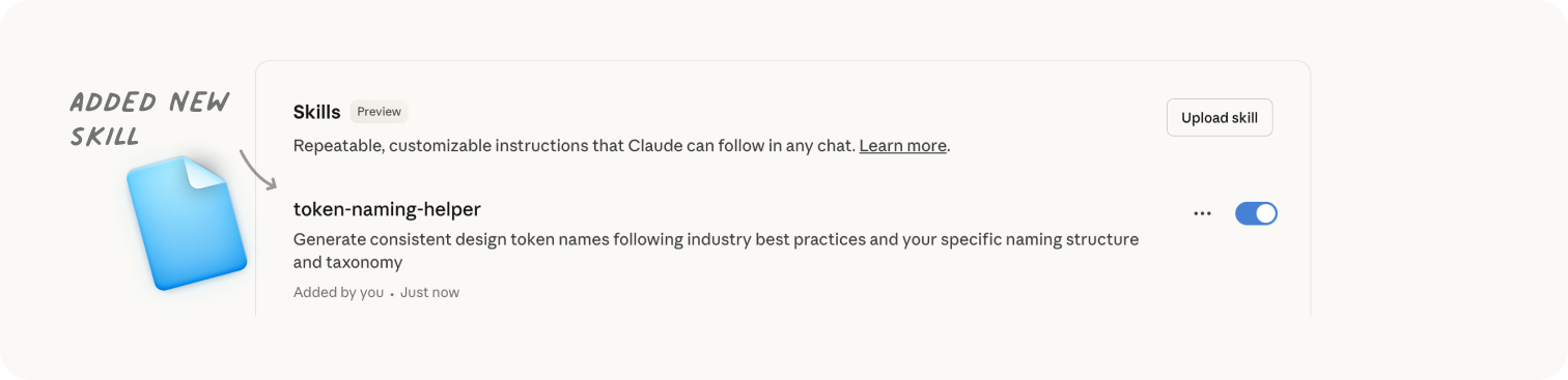
The problem: Naming tokens consistently is hard. Your team debates whether it should be color-accent-primary or primary-accent-color. New tokens don’t follow existing patterns. Naming becomes inconsistent across your system.
I already created namedesign tokens.guide, but now I wanted to apply the same knowledge inside Skills as well, so that I can utilize it whenever I use Claude.
The solution: This Skill enforces your token naming structure and suggests names based on your established patterns.
SKILL.md structure:
---
name: token-naming-helper
description: Generate consistent design token names following the component-category-role-state structure
---
# Token Naming Structure
## Naming Pattern
➡️ ADD YOUR OWN STRUCTURE HERE
{component}-{category}-{role}-{state}
## Required Elements (All Four Required)
- **Component**: UI element (button, input, card, modal, nav)
- **Category**: Property type (background, text, border, icon, shadow, spacing, size)
- **Role**: Variant/emphasis (primary, secondary, weak, strong, error, success, warning, info)
- **State**: Interactive state (default, hover, active, focused, disabled, selected)
## Order Matters
Always follow: component → category → role → state
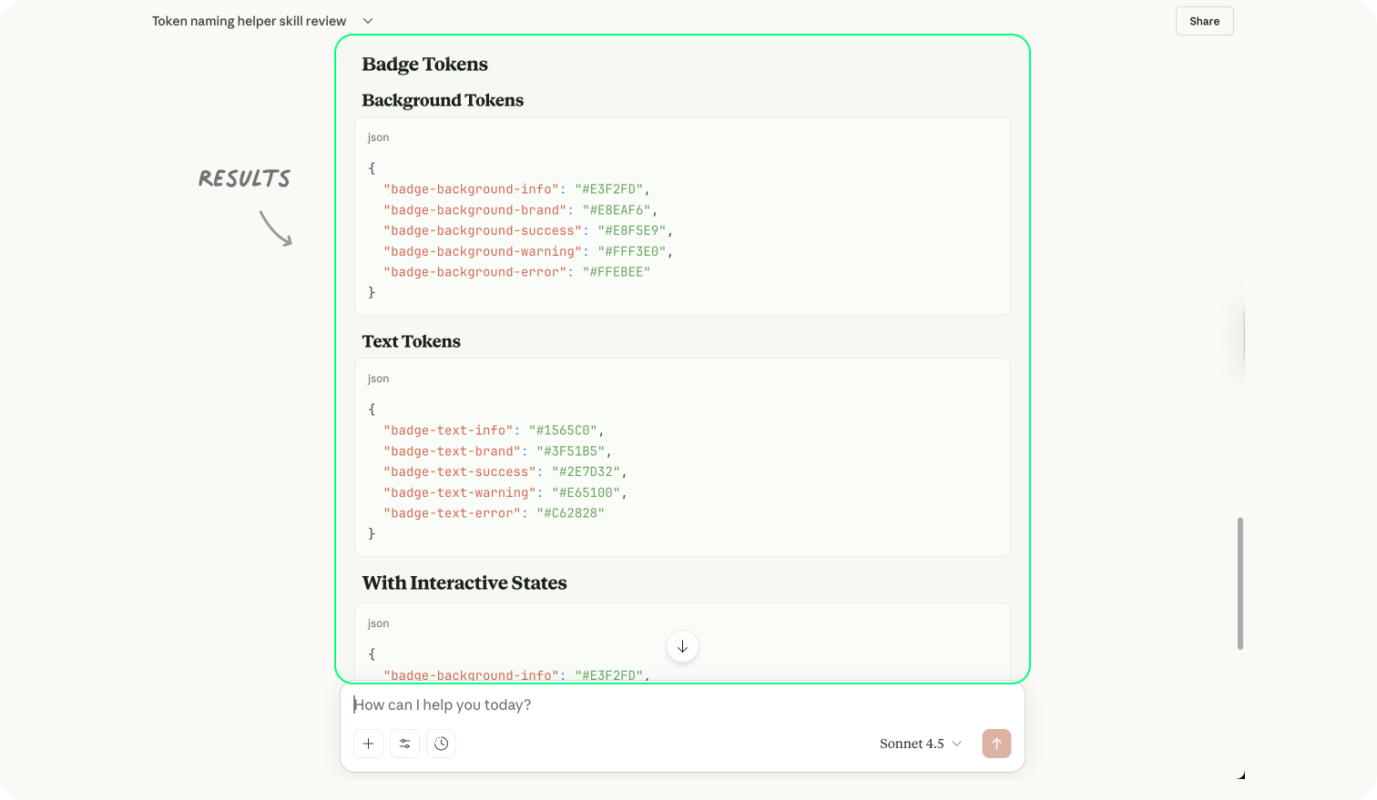
## Real Examples
{
“input-background-primary-default”: “#FFFFFF”,
“input-background-primary-focused”: “#FAFAFA”,
“input-border-primary-default”: “#E0E0E0”,
“input-border-primary-hover”: “#BDBDBD”,
“input-border-primary-focused”: “#2196F3”,
“input-border-error-focused”: “#F44336”
}Decision Tree
What component? → button, input, card
What property? → background, text, border
What variant/role? → primary, secondary, error
What state? → default, hover, focused
Result: “Name a token for primary button hover background” returns button-background-primary-hover. “What should I call the error state for input borders when focused?” returns input-border-error-focused. Consistent naming, every time.
2. Design token validator
The problem: Manual validation takes 30 minutes every time you update tokens, especially if your tokens are stored in multiple locations.
What it validates:
All references resolve correctly ({Light.semantic.primary} → {Core.blue.500} → #0969DA)
No circular references
Naming follows convention (category-concept-variant-state)
Semantic tokens exist in both light and dark modes
SKILL.md structure:
name: design-token-validator
description: Validate design tokens in Core.json and Modes files for consistency, circular references, and correct resolution to hex values


# Design Token Validation

## Token Structure
- Core.json: Base hex values organized by color families
- Modes/Light.json: Semantic tokens referencing Core
- Modes/Dark.json: Dark mode semantic tokens

## Validation Steps
1. Check JSON syntax is valid
2. Verify all token references resolve to hex values
3. Detect circular references
4. Confirm naming convention: {File.category.concept.variant}
5. Check light/dark parity (same semantic tokens in both modes)

## Scripts
Run: scripts/validate-tokens.js
Returns: List of errors with file:line numbers
Result: “Validate our design tokens” now takes 10 seconds. Script does mechanical checking. Claude explains what’s wrong and suggests fixes.
Critical setup: To push validated tokens to GitHub, install the GitHub MCP server BEFORE adding this Skill.
3. Accessibility audit with deterministic checks
The problem: Claude’s accessibility reports can appear accurate, but the contrast ratios may be incorrect.
The solution: Python scripts calculate actual contrast ratios, touch target sizes, and heading hierarchy. Playwright checks keyboard navigation programmatically. Claude interprets accurate data and provides remediation.
# Calculate actual contrast ratio, no LLM guessing
def calculate_contrast(color1_hex, color2_hex):
    rgb1 = hex_to_rgb(color1_hex)
    rgb2 = hex_to_rgb(color2_hex)
    l1 = relative_luminance(rgb1)
    l2 = relative_luminance(rgb2)
    return (max(l1, l2) + 0.05) / (min(l1, l2) + 0.05)

# Returns: 4.52 (passes WCAG AA for normal text)
Key sections:
## Accessibility Requirements
- Keyboard navigation (Tab, Enter, Space, Escape)
- ARIA labels and live regions
- Focus states with 3:1 contrast minimum
- Color contrast WCAG AA 4.5:1

## Theming Checks
- Uses design tokens exclusively (no hardcoded values)
- Light/dark mode support verified
- High contrast mode tested
- Respects prefers-reduced-motion

## Responsive Design
- Mobile (320-767px): Touch targets 44x44px minimum
- Tablet (768-1023px): Layout adapts smoothly
- Desktop (1024px+): Full feature set
4. Component documentation generator
The problem: You need to document components. Writing manually is repetitive. Team members write in different styles, making docs feel disjointed.
The solution: Generates complete component documentation following your exact structure and writing style. Every doc sounds like it came from the same person.
SKILL.md structure:
name: component-doc-generator
description: Generate standardized component documentation following our design system structure, tone, and writing guidelines


# Component Documentation Structure

## Standard Sections
1. Component Name & Description (one sentence)
2. When to Use (2-3 bullets)
3. When NOT to Use (2-3 bullets - prevents misuse)
4. Add your own

## Writing Guidelines
Describe here

## Reference Files
- Add examples for 3 complete component docs (Button, Input, Modal)
- Check token-reference.md for available design tokens
- See bad-examples.md for common documentation mistakes to avoid
Additionally, you can find more inspiration for documentation in this article:

5. Brand guidelines enforcer
The problem: Claude generates content or components that don’t follow your brand rules. You spend time correcting colors, spacing, typography, or tone.
The solution: This Skill applies your brand rules automatically to any design or content Claude generates.
What to include in SKILL.md:
Brand color palette with hex values
Typography scale and font families
Spacing system (8px grid, 4px compact)
Border radius values (0px, 4px, 8px, 16px)
Shadow elevations (sm, md, lg)
Motion duration and easing curves
Logo usage rules (clear space, minimum sizes)
Tone of voice guidelines
Result: Claude applies these automatically when generating components, documentation, or marketing materials. Every output matches your brand.
Why design systems need Skills (not just Projects)
The core problem: Design system work is repetitive by design. You’re constantly:
Explaining your token naming conventions
Describing your component architecture
Defining your documentation structure
Outlining your accessibility requirements
Specifying your brand guidelines
Before Skills: Copy-paste your guidelines into every conversation. Explain from scratch. Hope Claude interprets correctly.
After Skills: Document patterns once in a structured format. Claude automatically recognizes when to use them.
No more “Here’s how our tokens work” every time.
No more copying brand guidelines into every prompt.
No more re-explaining your component audit checklist.
Think of Skills like training a junior employee:
Give them specific instructions (skill.md)
Reference materials they can look up when needed (not everything at once)
Tools/scripts to do their job accurately (Python for calculations)
Clear boundaries on what they should do (no guessing)
Skills + MCP = Actual magic
Here’s where it gets powerful: Skills can call MCP servers to access external tools.
Essential MCP servers for design systems:
Figma MCP - Read designs, specs, tokens, components
GitHub MCP - Code review, token sync, PR automation
Mintlify MCP - Documentation lookup in your editor
PostHog MCP - Component analytics and adoption data
Slack MCP - Track design decisions in conversations
Critical order of operations:
Install MCP servers first ‼️
Then create Skills that use them
Claude calls MCPs automatically when the Skill needs them
Skills work with MCPs, but MCPs must be available before the Skill can use them.
Example workflow:
Skill: “Analyze component adoption”
Uses PostHog MCP to fetch usage data
Runs Python script to calculate adoption percentage
Uses GitHub MCP to find teams not on latest version
Claude interprets results and provides recommendations
However, I will write more about these advanced flows next time.
Let’s set Skills
Before you create Skills, enable them in settings:
Go to Settings → Features in Claude
Toggle on “Skills” (available for Pro, Max, Team, and Enterprise users)
For Team/Enterprise: Admins must enable Skills organization-wide first
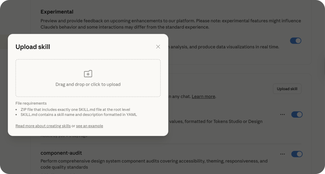
To add a Skill:
Create your folder structure locally
Upload it through the Skills interface in settings
Or use the built-in
skill-creatorSkill for interactive guidance
A Skill is just a folder structure:
my-design-skill/
├── SKILL.md          # Main instructions (required)
├── references/       # Context files (optional)
│   ├── brand-guidelines.md
│   ├── metrics-glossary.md
│   └── example-outputs.md
└── scripts/          # Executable code (optional)
    ├── validate.py
    ├── analyze.js
    └── transform.py
The SKILL.md file needs YAML frontmatter:
---
name: design-token-architecture
description: Sync design tokens between Figma, JSON, and Airtable using our token structure
---

# Design Token Sync Workflow

[Your detailed instructions here...]
Pro tip: The description field is how Claude decides whether to load your Skill. Be specific.
❌ “Helps with tokens”
✅ “Sync design tokens between Figma, JSON, and Airtable using our token structure”
Claude scans all Skill descriptions. If your description matches the task, Claude loads the full Skill content. This is incredibly efficient. You can have hundreds of Skills without bloating context.
When you have everything ready, it is best to compress ALL the files and upload a .zip file to Claude. If you only have a file, you need to name it SKILL.md
Reality check
Before Skills
Me: “Can you help me sync our design tokens to Airtable?”
Claude: “Sure! I’ll need some details:
Where are your token files located?
What format are they in?
What’s your Airtable schema?
How should I handle references between tokens?
Do you have dark mode tokens?
What naming convention do you use?”
[10 minutes of back-and-forth explaining everything] 🫠
After Skills
Me: “Sync the design tokens to Airtable”
Claude: [Loads design-token-architecture Skill]
“Syncing tokens using your token architecture...
✅ Loaded 127 core tokens from Core.json
✅ Resolved 45 semantic tokens (Light mode)
✅ Resolved 45 semantic tokens (Dark mode)
✅ Updated 78 Airtable records, created 12 new
✅ Complete”
Done in 30 seconds. Perfect accuracy. 😊
Make Skills for your team
Skills aren’t just personal. They’re perfect for team standardization.
For Team/Enterprise plans:
🤓 Admin enables Skills organization-wide
Team members install from your organization’s Skill library
Everyone uses the same design patterns
New hires get up to speed instantly 🫶
Let me know how it goes, and enjoy exploring,
Romina
— If you enjoyed this post, please tap the Like button below 💛 This helps me see what you want to read. Thank you.
More useful setups for your design system:


💎 Community Gems
🚀 SCALES 4.0.0 is out
Design Tokens Starter Set | JSON, Variables & Tokens Studio sync
Huge thanks to Philipp Jeroma, who makes this kit for free! 🫶
🔗 Link
✨ Figma Schema 2025
After Figma’s Schema conference this week, one thing is clear -> invest in your design system. They’ve made it easier, with many new features, like:
* Native JSON import/export for design tokens
* First stable version of the Design Tokens Specification (by DTCG group)
* Integrated design linter (checks design)
* Contrast checker
* AI content/help
* Components with context
* Slots (finally proper execution, no plugins needed)
* Expanded collections (Enterprise only)
* New sidebar
* Full-screen variables panel
* Figma Make kits