

What I Learned from Analyzing 158 Design Systems
What gets built first, what gets skipped, and what it costs you.

👋 Get weekly insights, tools, and templates to help you build and scale design systems. More: Design Tokens Mastery Course / YouTube / My Linkedin

I spent a few years collecting public design systems into my Airtable. I tracked what each system actually ships: tokens, GitHub repos. I have now used AI and gathered valuable insights.
The finding that surprised me most: almost no design system ships all the “layers”. They all make trade-offs. And the trade-offs follow a pattern.
The seven layers of a design system
A design system can serve its users in seven ways. I checked which of these layers each system makes publicly available:
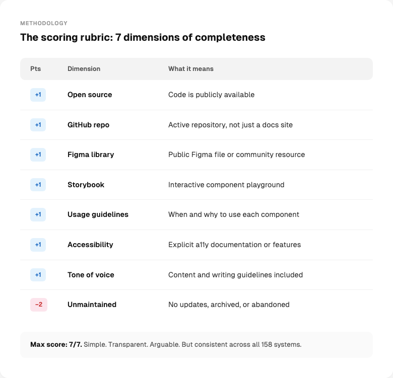
What this tells you
This measures how many layers a system makes available, not how good any layer is. It also only measures what’s public. Some systems have excellent internal Figma libraries, Storybooks, and docs that score low here because the outside world can’t see them. I’m not scoring quality. I’m mapping coverage.
A note on the dataset
The 158 systems were collected from public sources: documentation sites, GitHub repositories, Figma community files, npm registries, and design system directories. Each entry was manually verified against its live URL. Some systems required deeper digging than others.
What the data shows
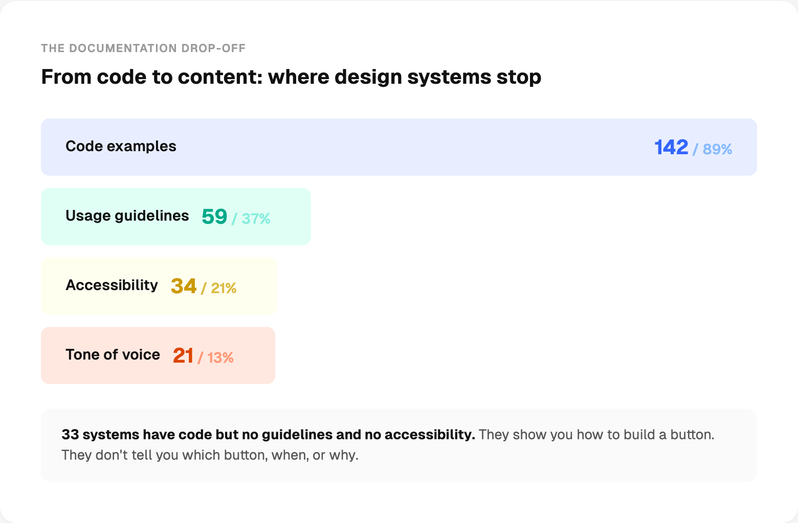
89% have code examples. That’s the first layer teams build. But after that, each subsequent layer drops off sharply. Only 37% add usage guidelines. Only 21% document accessibility. Only 13% include content guidelines.
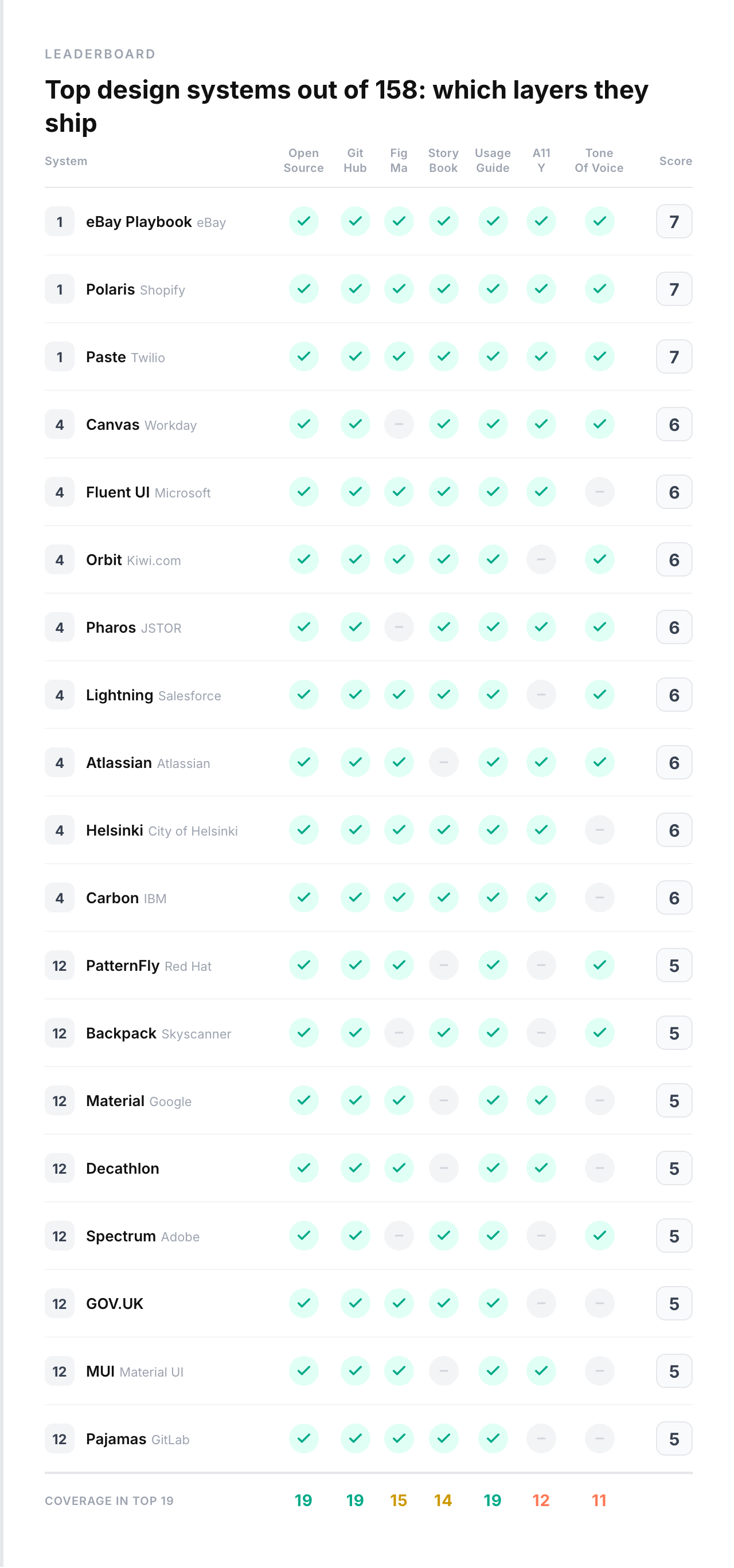
Three systems scored a perfect 7: Polaris (Shopify), Paste (Twilio), and eBay Playbook.

The leaderboard
Look at the top. Shopify. Twilio. Workday. Microsoft. Salesforce. These are companies with dedicated design infrastructure teams and years of investment. The gap between them and the average is not small.
Accessibility is still a lower priority
Only 34 systems explicitly mention accessibility. That’s 21%.
4 systems have accessibility issues flagged. Meaning someone noted problems.
Some of these systems probably have accessible components under the hood. They just don’t document it or surface it as a priority. But if you don’t talk about it, your adopters won’t prioritize it either.
The tech landscape
React dominates. But the picture is more interesting than “React won.”
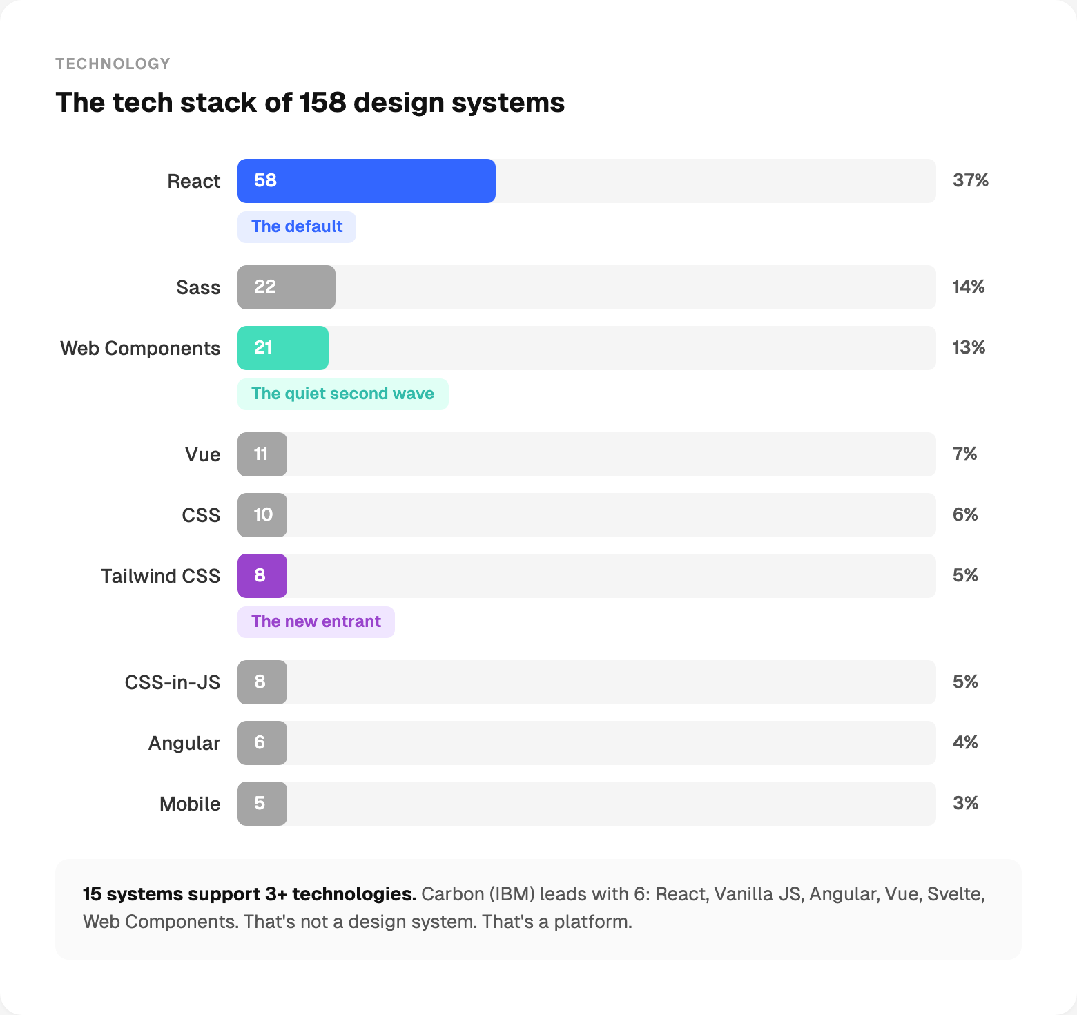
React is the default. More than half of all systems use it. No surprise.
Web Components are the quiet second wave. These are not startups experimenting. These are large organizations making a deliberate bet on framework-agnostic components.
Tailwind is the new entrant. 8 systems: shadcn/ui, daisyUI, Flowbite, Tremor, HeroUI, Nessie, Nuxt UI, Park UI. All relatively new. All growing fast. The utility-first, copy-paste model is rewriting the distribution rules.
15 systems support 3+ technologies. Carbon (IBM) leads with 6: React, Vanilla JS, Angular, Vue, Svelte, Web Components. That’s not a design system. That’s a platform.
The Tailwind gap
This one surprised me.
There are 8 Tailwind-based design systems in the dataset: shadcn/ui, daisyUI, Flowbite, Tremor, HeroUI, Nessie, Nuxt UI, Park UI. They are some of the fastest-growing projects in the ecosystem. shadcn/ui alone has 112K GitHub stars.
But across all 8 systems, not a single one documents accessibility. Not one includes content guidelines.
This isn’t a criticism of Tailwind. It’s a pattern about what happens when the distribution model is “copy this code.” The copy-paste philosophy solves the adoption problem brilliantly. But it skips the layers that make a design system more than a component starter kit. When you own the code, nobody is responsible for documenting when to use it, how to make it accessible, or how to write the words inside it.
The question is whether these systems will fill in those layers as they mature. Or whether the “you own it, you document it” model means those layers never get built centrally.
Tone of voice
Only 21 systems out of 158 include content guidelines. 13%.
But look at which 20. Sainsbury’s. Polaris (Shopify). Atlassian. Lightning (Salesforce). NHS Digital. Pharos (JSTOR). Bolt. Workday Canvas. Paste (Twilio).
These are retail, fintech, healthcare, government, and enterprise SaaS. Industries where getting the words wrong has consequences. An error message that says the wrong thing in a banking app isn’t just bad UX. It’s a compliance risk. A healthcare system that uses inconsistent terminology isn’t just confusing. It’s dangerous.
The systems that ship tone of voice aren’t doing it because they’re more thorough than everyone else. They’re doing it because their industry demands it. Content guidelines aren’t a “nice to have” when regulators read your interfaces.
But compliance isn’t the only reason. When 10 teams use your Button component and each writes different label text, different error messages, different confirmation dialogs, your product speaks in 10 different voices. Content guidelines aren’t a legal checkbox. They’re how you keep the experience consistent at scale. Without them, your design system controls how things look but not what they say. That’s half a system.
The documentation gap
89% of systems have code examples.
But only 37% tell you when to use a component. Only 21% tell you how to make it accessible. Only 13% tell you how to write the content inside it.
33 systems have code examples but no usage guidelines and no accessibility documentation. They show you how to implement a button. They don’t tell you which button to use, when, or why.
A design system without usage guidelines is a component library. A component library without accessibility documentation is a liability.
How many components do the top systems actually ship?
This one gets misunderstood constantly. People equate “big design system” with “lots of components.” The data says otherwise.
The range is massive.
More components is not better. More components is more to maintain, more to document, more to keep accessible. The systems that score highest aren’t the ones with the most components. They’re the ones that document the components they have.
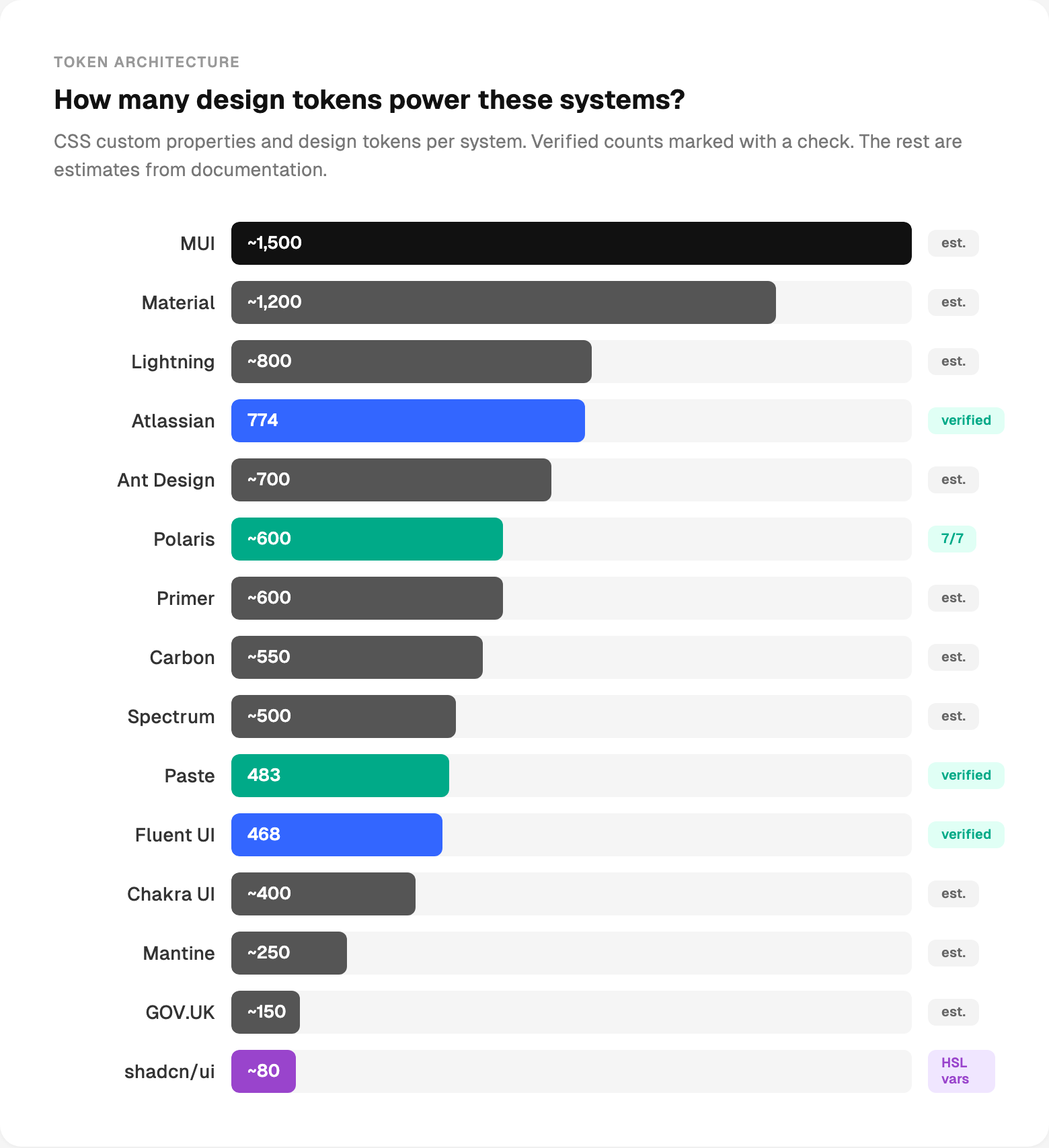
How many design tokens power these systems?
I counted CSS custom properties and documented tokens across the top systems. Some counts are verified from the source code. Others are estimates from documentation.
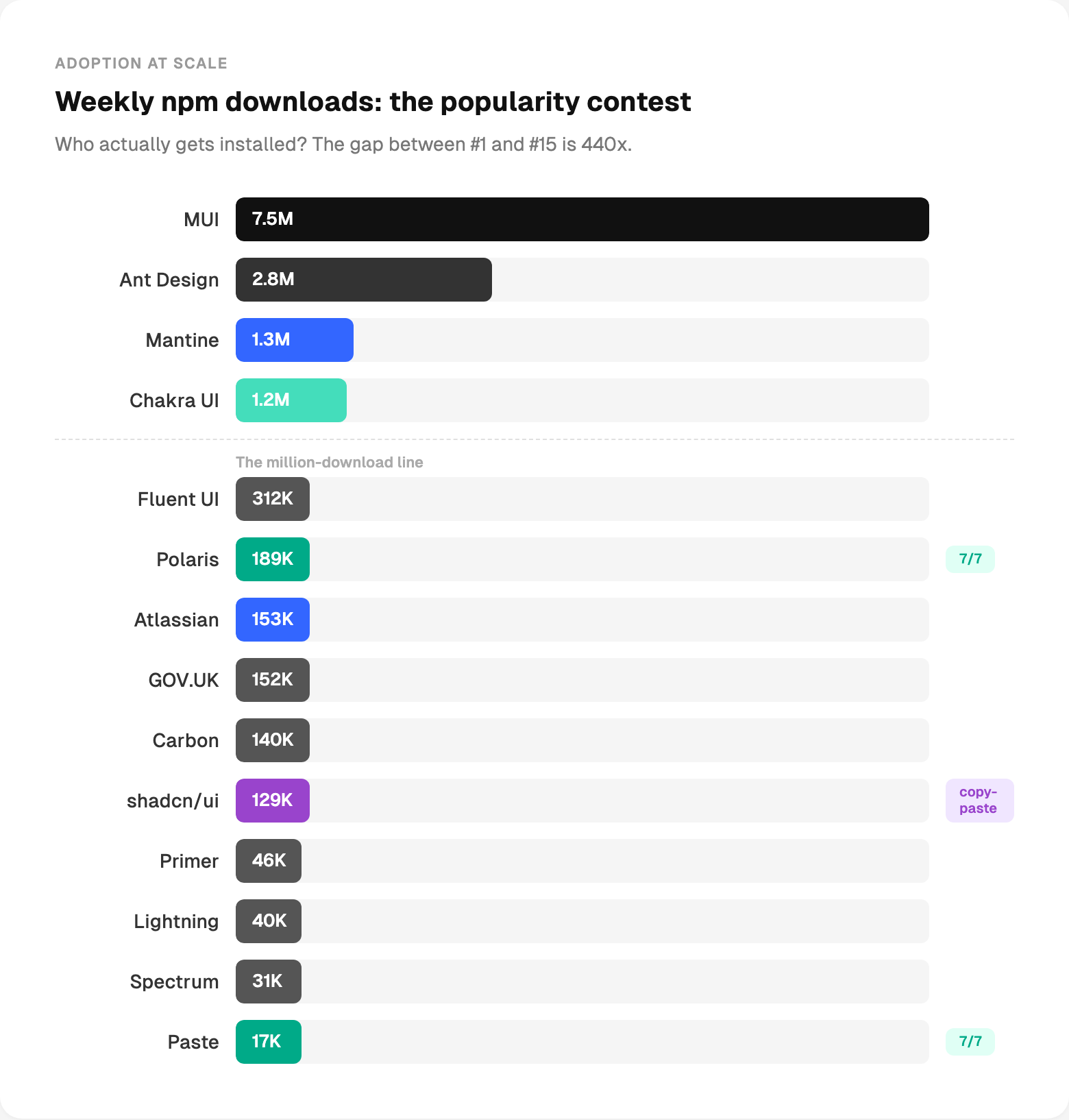
The popularity contest nobody asked for
npm downloads measure one thing: who gets npm installed. Open community libraries naturally dominate here. Enterprise and internal systems are consumed behind firewalls, not through public registries.
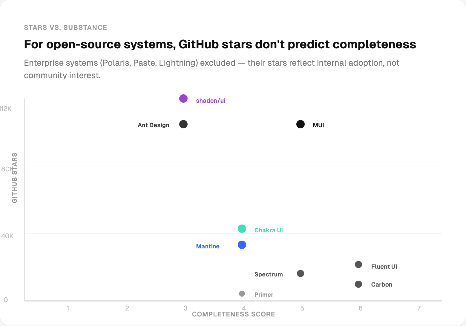
Stars don’t mean what you think
I almost didn’t include this chart. But the myth of “more stars = better system” needs data thrown at it.
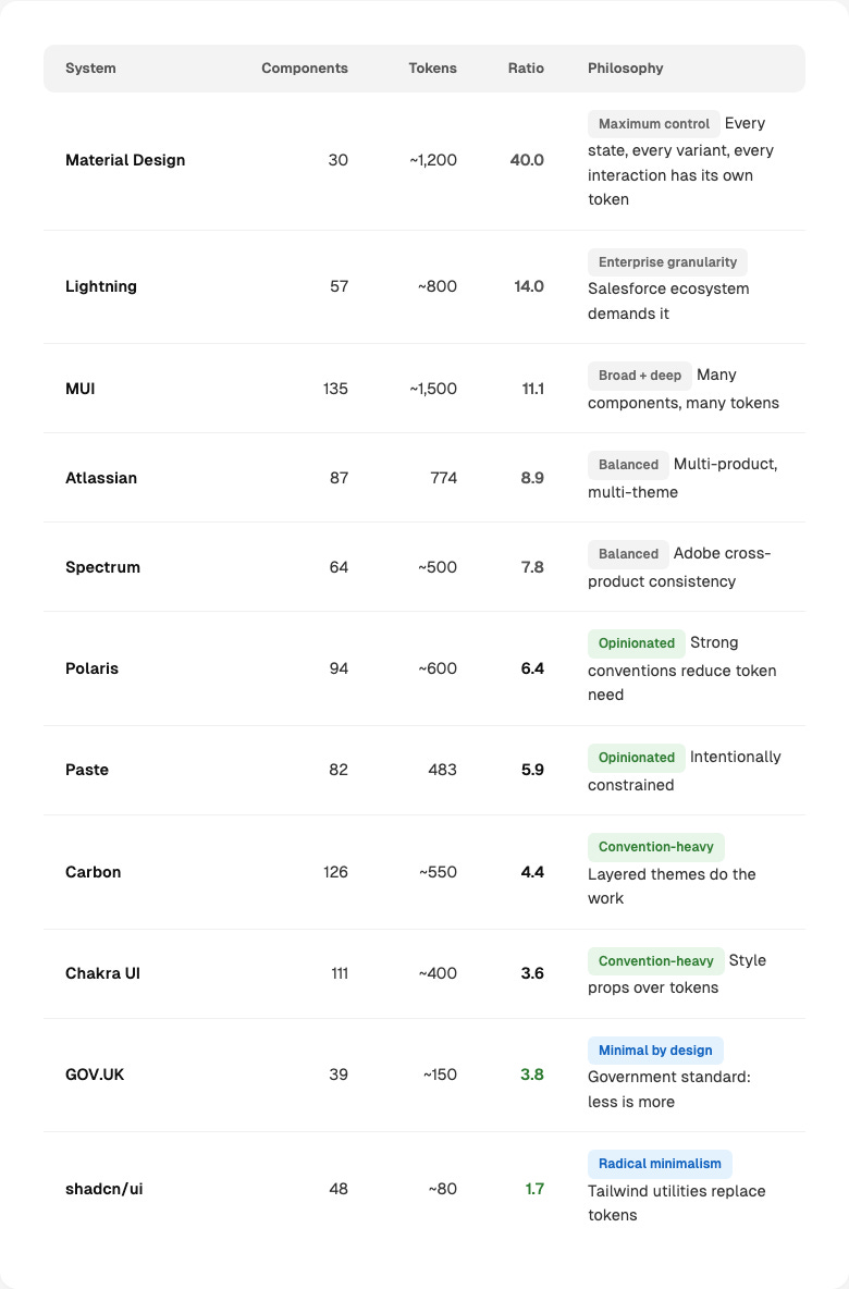
The architecture fingerprint
I divided each system’s token count by its component count. The ratio tells you something fundamental about design philosophy.
I’ve thrown a lot of numbers at you. Here’s what they change about how I’d build a design system today.
Write usage guidelines before building more components.
Add accessibility documentation now.
Add Storybook before another component.
Ship decision logic, not just components.
Content guidelines are required if you’re regulated.
Fund it like an infrastructure.
Why this matters more than it used to
I’ve spent the past year building agentic design systems. AI agents that audit tokens, compose patterns, generate documentation, and open pull requests. I wrote about the architecture in Parts 1, 2 and 3 of that series.
But here’s the thing I keep running into: agents can only work with what’s documented. An AI agent can’t use a component that has no usage guidelines. It can’t check accessibility if accessibility isn’t described. It can’t compose a pattern from a system that only ships code and a landing page.
Everyone is talking about AI agents for design systems. This data shows that many systems aren’t ready for a human to use properly, let alone a machine.
Fix the layers first. The agents will follow. 🙌
— If you enjoyed this post, please tap the Like button below 💛 This helps me see what you want to read. Thank you.
💎 Community Gems
MemPalace / Free, local AI memory system that stores your entire chat history and makes it searchable across sessions. 96.6% recall, no cloud, works with Claude/Cursor/ChatGPT
🔗 Link

Do you have a tool or benchmark to compare our design systems following the same methodology? it would be interesting to know where our not-so-popular DS perform against the big players