


👋 Get weekly insights, tools, and templates to help you build and scale design systems. More: Design Tokens Mastery Course / AI Design Guide / My Linkedin
Let’s kick off this post with a quick exercise. Open any SaaS dashboard. The look and feel is mostly as it was 10 years ago. When there is no data, you see a bunch of empty cards; with data, maybe a few more charts appear.
I also opened Mobbin for dashboards and compared them. Calendly, Shopify, Framer, Semrush, Mintlify, AirOps, Sweatpals. Although they are completely different products in different industries with different price points, they all have almost the same layout. That makes sense: when people spend more time in products, they learn the layout faster.
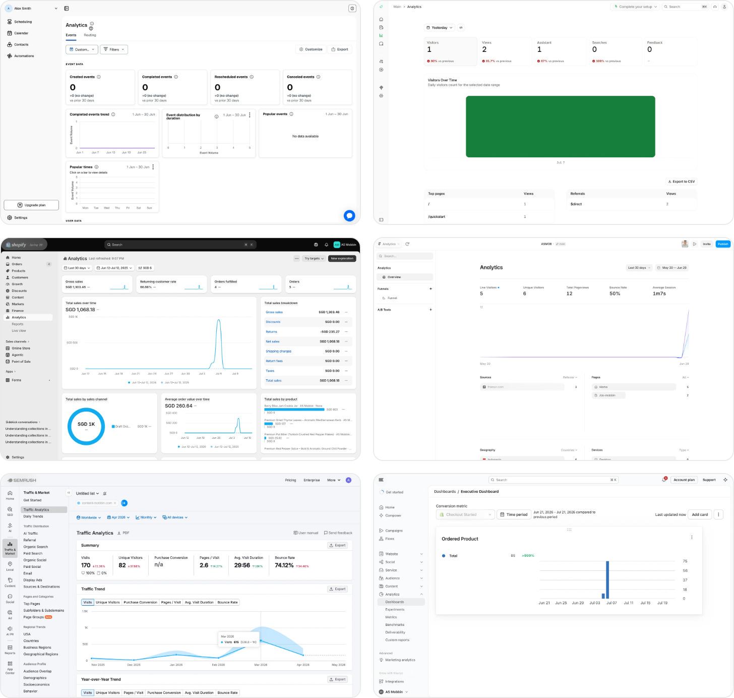
Well, a familiar layout is a kindness: it means a person can walk into a new product the way you walk into a stranger’s kitchen and still find the spoons. What troubles me is that content and blocks themselves are still stupid.
I’ve been working with design systems for more than 10 years. In that time, we have learned to name our colors properly, switch themes with a single toggle, and scale our decisions to different products faster. But with today’s technology, we still lack intent-based dashboards. These blocks do not know what they are for.
In this post, I will explain how I envision smarter products through implementing intent-based design systems. I also believe this approach is the future of building products.
A brief history of getting “default taste”
To understand sameness and AI slop (where everything looks vibe-coded ugly), we need to go back in history. Defaults are coming from popular UI kits and Claude.
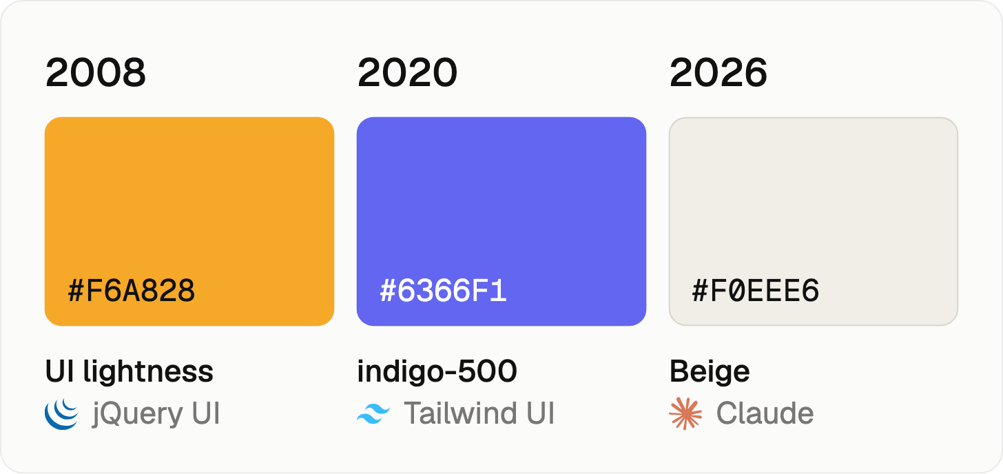
In 2008, it was orange. jQuery shipped the orange theme, and many people simply reused it without modifying it.
In 2020, it was indigo-500 from Tailwind UI. Adam Wathan chose it, and at the time it felt fresh. Then the models read the internet, and the internet was full of Tailwind-ish sites, so they followed the logic. And yep, this is where violet vibe-coded thingies are coming from.
In 2026, it is beige. This is coming from Claude. I’m sure you’ve seen warm, beige backgrounds, italic serif hero, 2-color text.


But why does everything look the same? Because the model just uses the average of all the screens it has seen. Even longer prompts don’t help, because models will, either way, move to the next logical design decision (or trend). There is a more detailed technical description how these things work from Paul Bakaus on the link.
How to fight this? The first obvious thing people do is to create a bunch of markdown files with rules. “No purple gradients.” “Don’t use Inter.” But the problem will repeat with new trends. To skip generic, you need to create your own foundations and knowledge graph. And then turn that into a shareable artifact. It can be a virtual server or a shared repository.
Dashboards can’t think
Back to those dashboards from the intro. Now let’s check concrete situations. Let’s look at the empty cards first.
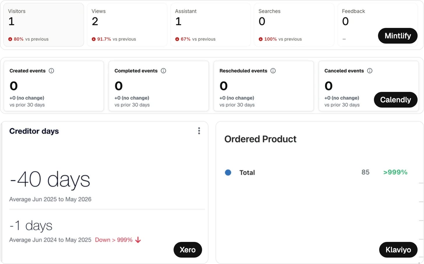
Mintlify shows 80% vs. previous. The number is correct, but the red color shows panic. In reality, you had five visitors last week and one this week. Nobody sensible would lose sleep over it.
Similar story with Xero, Klaviyo, and Calendly. Cards show the math behind it, but users still need to connect the dots. Does it matter? Do they need to worry? What to do next?
Also, empty screens could be way more helpful. Zero is not the news here. Show users “how to get to your first visitor” or where to explore more options, connect data, etc. Be intentional and think about all intents and then improve the user experience.
Enter the assistant era
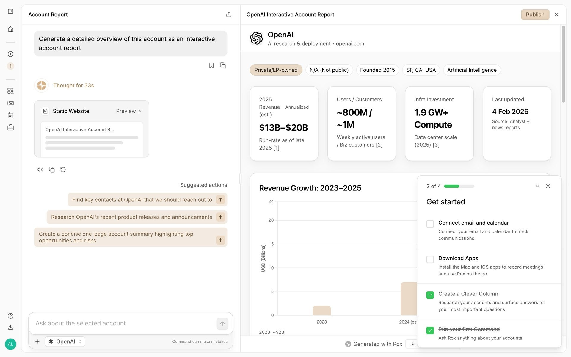
Then came the AI boom, and products with a lot of data have a huge advantage in making their products better and smarter.
What most of them did was introduce AI assistants. By clicking on the “stars icon,” the AI process started showing more comments about the numbers.
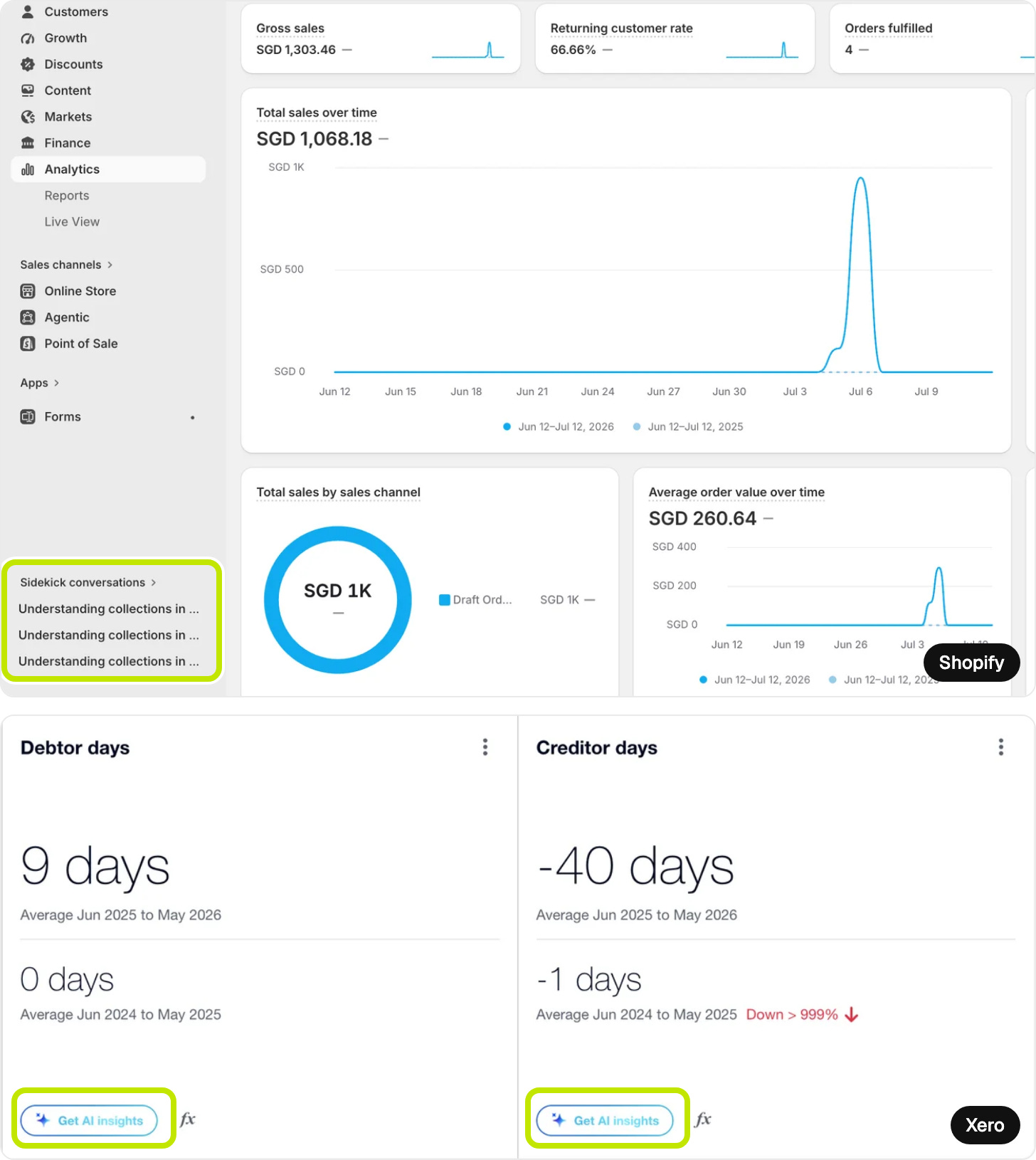
Shopify added Sidekick conversations. Xero added a button for “Get AI insights”.
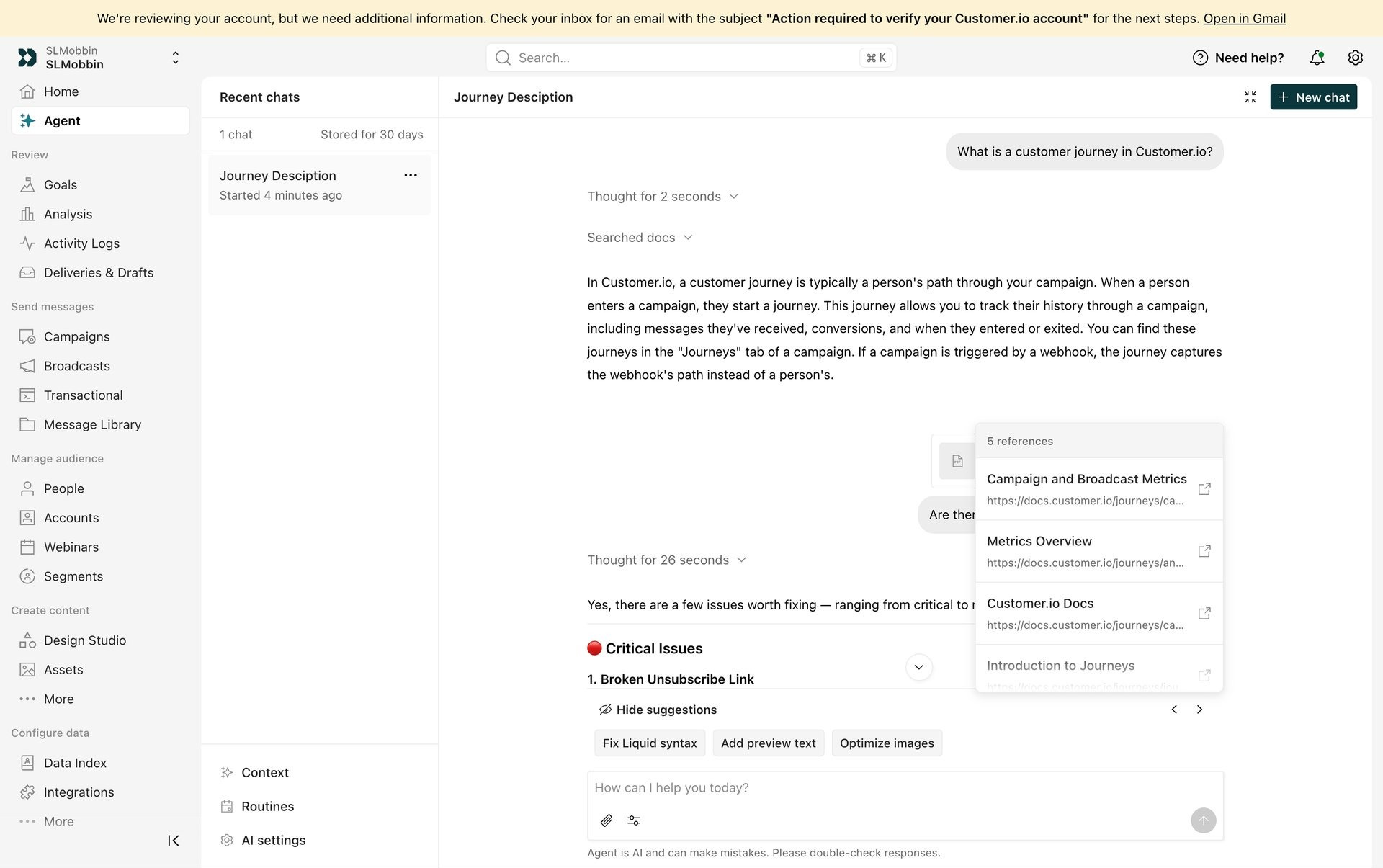
So the blocks stayed exactly as they were, and the thinking went into a chat window beside them. It can feel like the product got smarter, but I expected it to give me concrete next steps: what can I improve? But these answers took forever, and usually they were not really helpful. Why? Lack of context.
Adding more context phase
So naturally, we gave context. More files. More folders. Just EVERYTHING we have phase. Like a worried parent packs a suitcase for every weather. This is not really helpful.
If you don’t know what you are looking for, you will not get any answers.
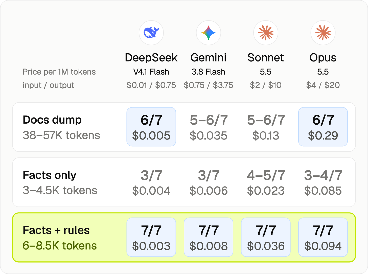
I tested this with a simple task, where an AI tool had to create a developer handoff for a button. I have a design system built on Shoelace. It had to go through 7 checks: sizes, allowed and banned variants, tokens, one primary button per screen, a confirm dialog if there is something to confirm, and slots.
Each model got the same task with three kinds of context:
→ file dump (everything I have)
→ facts only (deterministic)
→ facts + rules
I tested the prices on October 3, and you can compare them below.
How did it go?
Facts only was the worst. Yes, it knows when to use a specific variant, but it did not follow the rules.
The docs dump did better (because the info was there somewhere); but it was the most expensive.
Facts + rules passed on every model (even on the cheapest DeepSeek). For example, for Opus, swapping the docs dump for facts + rules costs two-thirds less. Those aren’t facts about the component. They’re intent.
Intent as the most underused layer
I keep returning to one word: intent. With intent-based content, the cards would change based on the user’s needs. This means dashboards become personalized. Practically speaking, a manager wants to see different content than a designer. Intent can live at four levels, like the floors of a house:
Token intent. What a value is for.
Component intent. How and when a component should be used.
Pattern intent. How components work together, and why.
Screen intent. What a whole screen is for.
rule: one-primary-action
applies_to: screen
check: count(Button[variant=primary]) <= 1
severity: block
why: Two primary actions means nobody decided what matters.
Intent-based dashboards
This is the part that makes me want to stand on a chair.
When blocks carry their intent, the system can combine components and create a a personalized dashboard. These rules would easily fix empty cards on Mintlify, Zero, and Calendly.
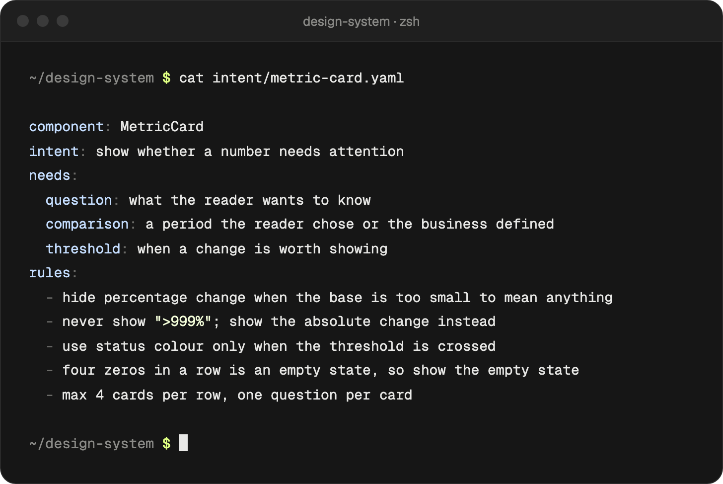
Almost none of these rules are about pixels. That’s the point of intent. You write it once, and then you review it over time (based on conversion rate, product decisions, and so on).
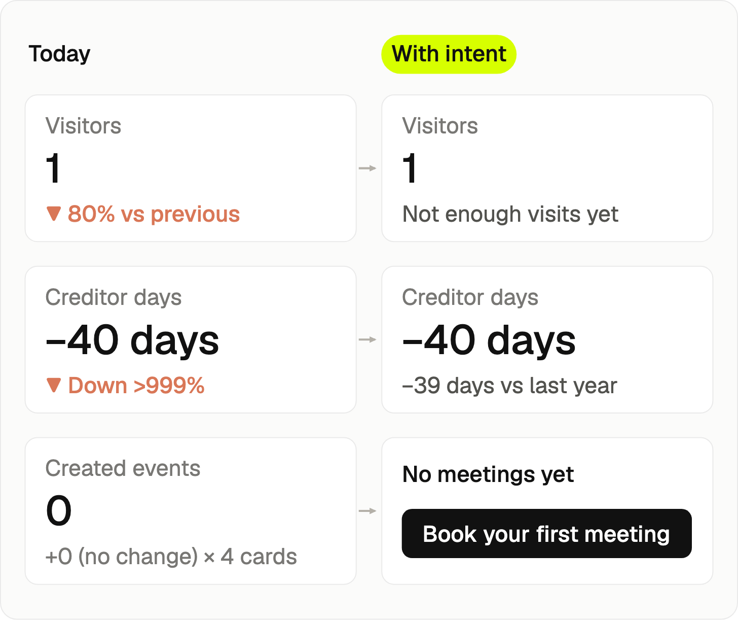
Now let’s check another example.
Let’s give an agent a library of blocks like that and another piece of intent: what is this person trying to decide?
Comparing the dashboard for a finance lead vs. a support lead would open the same product, but the cards would show different content. But it is still the same design system.
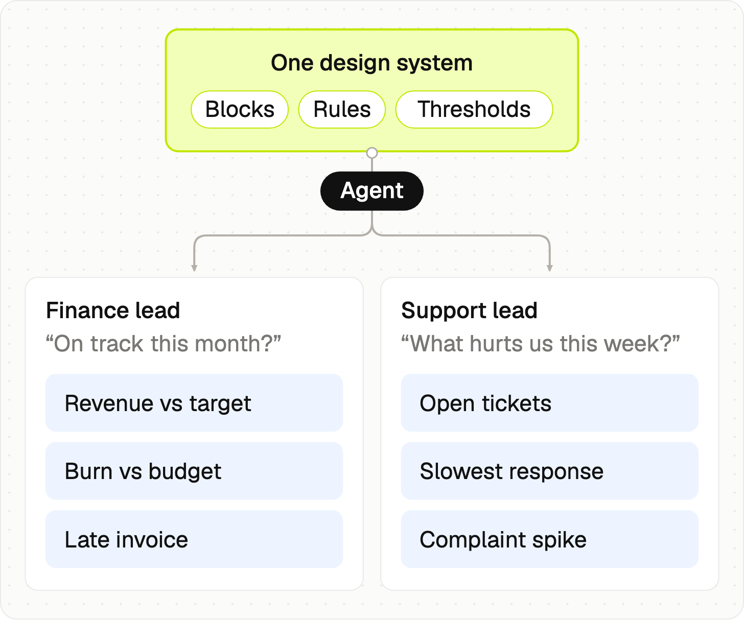
The goal is to set the limits in our design system, then let agents work within them.
Sure, things can go wrong. When the finance lead and the support lead see different layouts, they might get confused (especially in the same meeting). Some users might want to see the whole picture (“admin view”) and not just a personalized view. And layouts should not just jump around with every refresh. But dashboards are just part of the story. The same intent can shape every flow in a product: onboarding that skips things you already did, empty states that are based on where you came from, an error message based on the user intent, … That’s why we need to start treating intent layer not as an option, but as a default.
You can only enforce what you own
Here is the catch. A rule only works if your agent can read it.

The prompt isn’t where your work is, and this post from Thariq sums it up perfectly. Prompt is one thing, but your environment changes EVERYTHING. The repositories, references, context, knowledge, decisions, examples, …
The less your team owns, the more your work will look like everybody else’s.
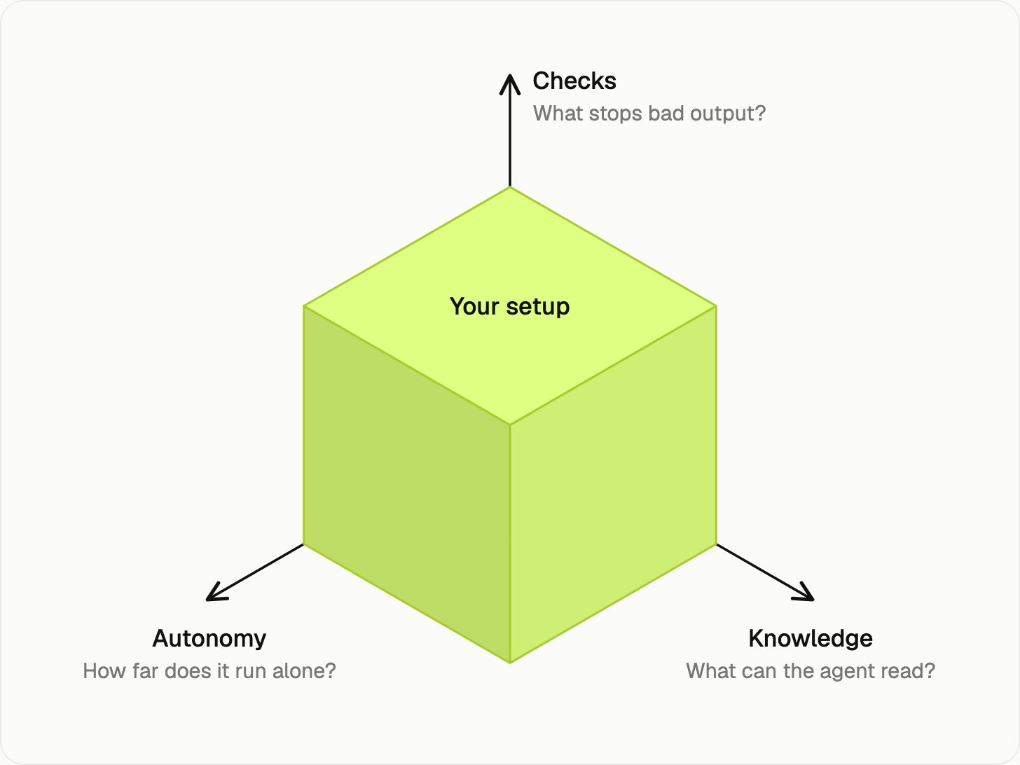
So a better question than “what is your prompt?” is “what can your agent read?”.
If part of your documentation is on Storybook, half on some other platform, some in Figma, and parts of it in Markdown files, then you know you have a challenge to solve.
“Renting” apps is still fine on some occasions. It does not mean you have to “vibe-code” every possible app. But if all your data lives in 3rd-party platforms and you rely only on their MCPs or APIs, you are losing time (and data, of course!) with manual work.
So what’s next for you?
Start by putting your rules in files. Pick one card/component from your dashboard. What would it say? Write down what it’s for, when a change is worth showing, and what it should say when there is no data. Then let your agent read it.
Enjoy exploring 🙌
— If you enjoyed this post, please tap the Like button below 💛 This helps me see what you want to read. Thank you.
PS. I wrote about these already, and it might help you as well 👇


Learn more and references
🔗 Mobbin dashboard screens
🔗 Paul Bakaus, “The Dark Arts of Skill Engineering“, AI Engineer
🔗 Filament Group, Introducing ThemeRoller (2008)
🔗 Adam Wathan’s post, August 2025:
🔗 Alan West, Why every AI-built website looks the same
Find more helpful guides at aidesign.guide