

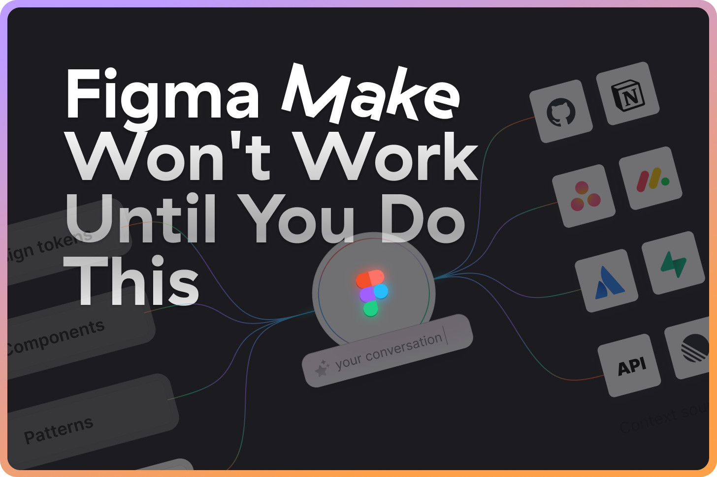
Figma Make Won't Work Until You Do This
Full guide + practical examples

👋 Get weekly insights, tools, and templates to help you build and scale design systems. More: Design Tokens Mastery Course / YouTube / My Linkedin
Product teams do not struggle to design screens. They struggle to validate ideas fast without creating a mess.
Most AI prototyping tools force you to leave Figma, and then you spend time translating the output back into your file.
Figma Make solves a specific problem: it helps you generate functional prototypes while staying inside the Figma file where your team already works.
If you have a design system, Figma Make can reuse it. If you do not, it still helps you move faster on flow, states, and interactions.
What you will get from this article
A clear decision framework for when to use Figma Make.
A step-by-step workflow you can run today, including the setup most people miss.
Prompt templates that force design system consistency.
Four concrete examples:
Prototype with 4 versions
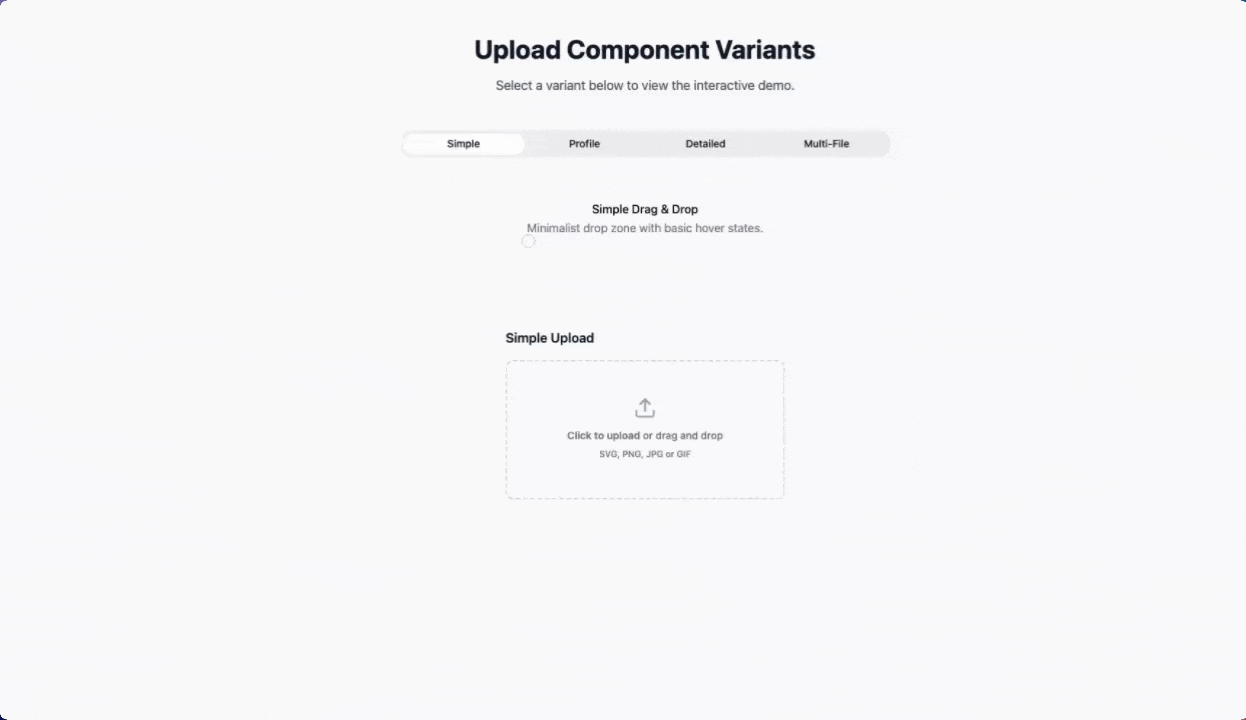
Simple example: a mobile learning flashcard prototype
Design system example: a Figma Make prototype with existing components
Advanced example: an illustration gallery powered by Supabase + CDN (API)
The real problem is context loss
Most “AI prototyping” workflows look like this:
You design in Figma.
You leave Figma to generate code in another tool.
The tool invents new components and styling.
You spend time swapping everything back to your system.
You hand it off, and the team debates what is real.
The tools are not the enemy. Context loss is.
With Make, you have direct access to:
Your components (and their variants).
Your variables (colors, spacing, typography).
Your naming conventions (which encode decisions).
Figma Make keeps that context close. That is the whole point.
The design system advantage
If you do not connect your libraries, you get generic output. Period.
When you enable the right libraries, Figma Make can treat them as “building blocks” and generate prototypes using:
Your button (with the variants you already defined).
Your spacing tokens (instead of hardcoded values).
Your card, table, bodal, stepper (instead of invented UI).
That is the difference between “AI-generated UI” and “AI-generated UI that your team can actually review.”
One more lever matters: connectors. If your requirements and content live outside Figma (Notion, GitHub, Linear, Jira, and more), you can pull them in so the prototype reflects the actual spec and copy, not your best guess.
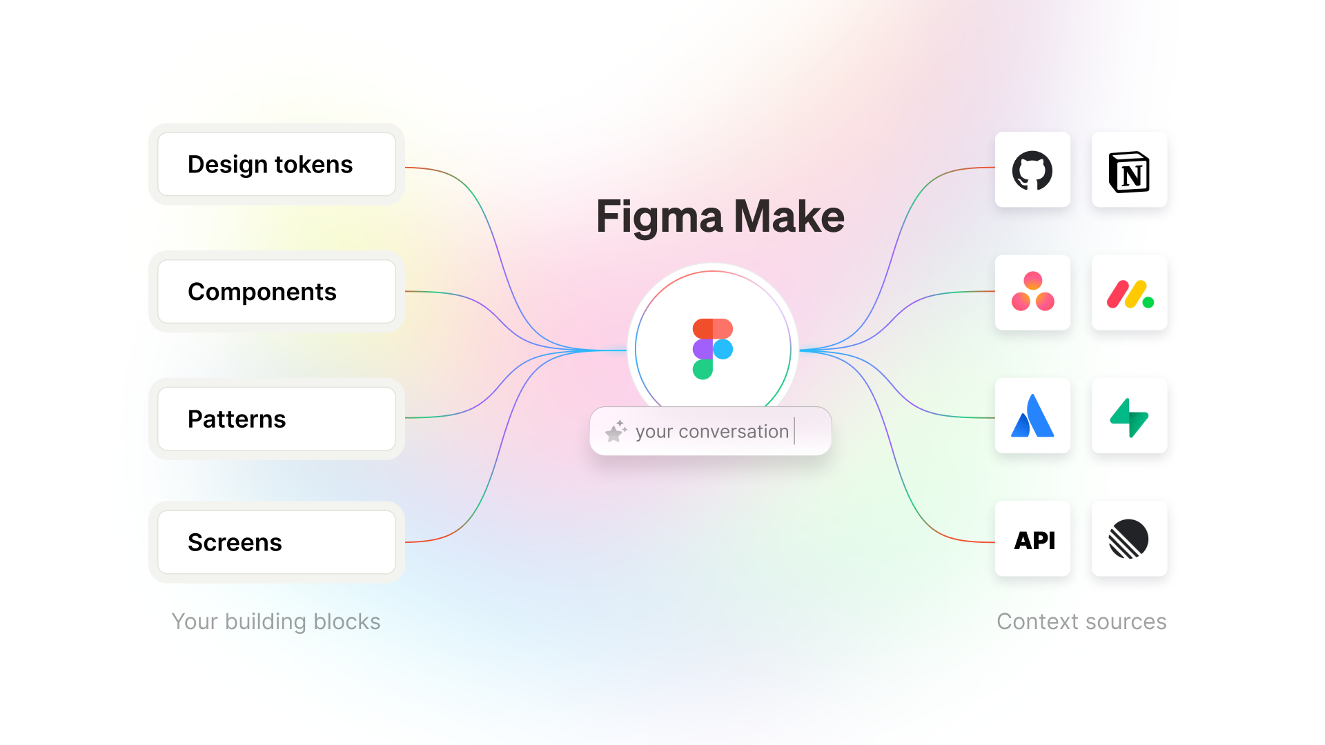
Here is the mental model: your Figma libraries are the building blocks, and connectors plus APIs are the context sources.
The complete workflow (setup to output)
This is the workflow I recommend for designers who want speed without sacrificing consistency.
Phase 1: Setup (5 minutes)
Step 1: Turn on the correct libraries
Open the file where you will prototype.
Go to Assets → Team library.
Enable the libraries you want Figma Make to use.
Checkpoint: you can insert your system components manually from the Assets panel.
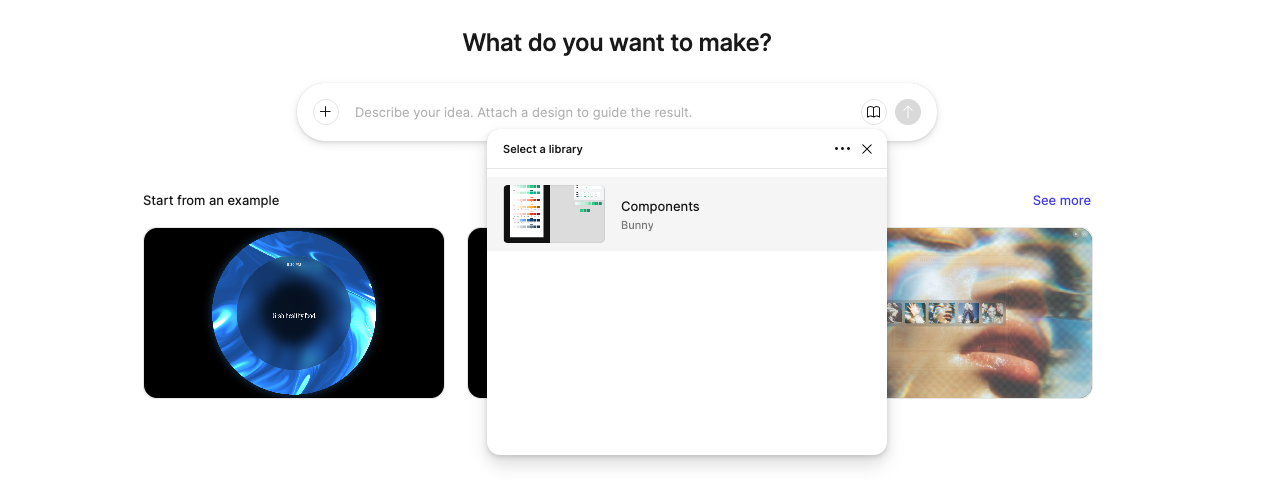
Step 2: Learn the component names you will reference
Figma Make responds best when you use names exactly as they appear in your library. If your component name reads Button/Primary, use that.
Checkpoint: write down 8 to 12 component names you expect in most screens (Button, Input, Select, Card, Table, Modal, Toast, SideNav).
Now try to create a prototype with and without your library. You can see the difference below with my example.
Step 3: Decide what “done” means for the prototype
You will iterate faster when you define the boundary.
Are you validating flow, layout, copy, or interaction?
What states must exist (loading, empty, error, success)?
Phase 2: Prompting with design system context
Don’t add generic prompts. Think about what you need, structure the prompt and the idea, and then copy/paste it. For complex prototypes, I start with the longer prompt, where I specify all the things. Once I see the prototype, I use shorter prompts.
Examples:
Prompt template: system-first screen
“Create a [screen name] using my [layout component] and my [form/data components]. Use spacing tokens for all margins and gaps. Include loading, empty, and error states. Use component names exactly as defined in my library.”
Example: settings screen
“Create a settings page using my
SideNavon the left. Build a form withInput,Select, andCheckboxcomponents. Use page spacing tokens and includeButton/Primaryfor Save andButton/Secondaryfor Cancel. Include validation states and an error banner.”
Complex example:
Responsive Illustration Gallery (check the video below)
Create a clean, minimal illustration gallery that fetches artwork from a bunny.net CDN.
Design System & Styling:
Strict Adherence: The UI must strictly adhere to the design system defined in
/styles/globals.css.Typography: Use ONLY the Geist font family as defined in the global CSS. Do not import or use any other fonts.
Variables: Use the specific CSS variables defined in
globals.cssfor all colors (e.g.,--background,--foreground,--primary,--card), spacing, borders, and radius (--radius,--radius-card).Data Source:
Fetch the list of illustrations from bunny.net using the available environment secrets:
BUNNY_STORAGE_ZONE,BUNNY_ACCESS_KEY, andBUNNY_CDN_URL.(💡 this is why you need Supabase)
Core Features:
Dynamic Categorization:
Parse the filenames of the fetched images.
Extract the first word of the filename to serve as the “Category” (e.g., “Billing-icon.png” → “Billing”).
This logic should drive both the display tags and the filter options.
Search & Filter Interface:
Search: A text input to filter images by filename.
Filter Dropdown: A
Selectmenu positioned immediately next to the search bar.Dynamic Options: The dropdown options must be automatically generated from the unique categories found in the file list.
Gallery Grid:
Render a responsive grid of
IllustrationCardcomponents.IllustrationCard: Must display the image thumbnail, the filename, and the extracted category tag.
Interactions:
Lightbox: Clicking a card should open a modal/lightbox for a full-size preview.
Download: Include a button to download the original file directly.
Implementation:
Use React and Tailwind CSS.
Use
lucide-reactfor icons.Ensure the layout is fully responsive for mobile and desktop.
Phase 3: Iteration (the loop that saves you time)
Don’t expect “pixel-perfect” prototypes from the first prompt. You will need to iterate a bit to get it how you want it to look.
Iteration loop
Generate the screen.
Fix the layout and hierarchy in Figma (auto layout, spacing, alignment).
Swap variants (Primary to Secondary, compact to regular).
Prompt for one change at a time (do not stack requests).
Rule: if the output drifts from your system, stop prompting and fix the system reference in the next prompt.
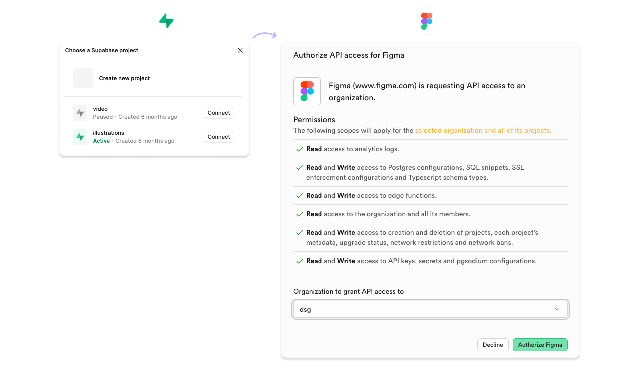
Phase 4: Connecting external tools (Connectors)
Figma Make can connect to external tools via MCP so you can pull specs in as context instead of copy-pasting.
Common connectors:
Supabase
Notion
GitHub
Linear
Asana
Atlassian (Confluence, Jira, Compass)
monday.com
API
Example: Build from a Notion PRD
Setup
Click Add context in the chat box.
Select Add connector and choose Notion.
Authenticate.
Enable read tools.
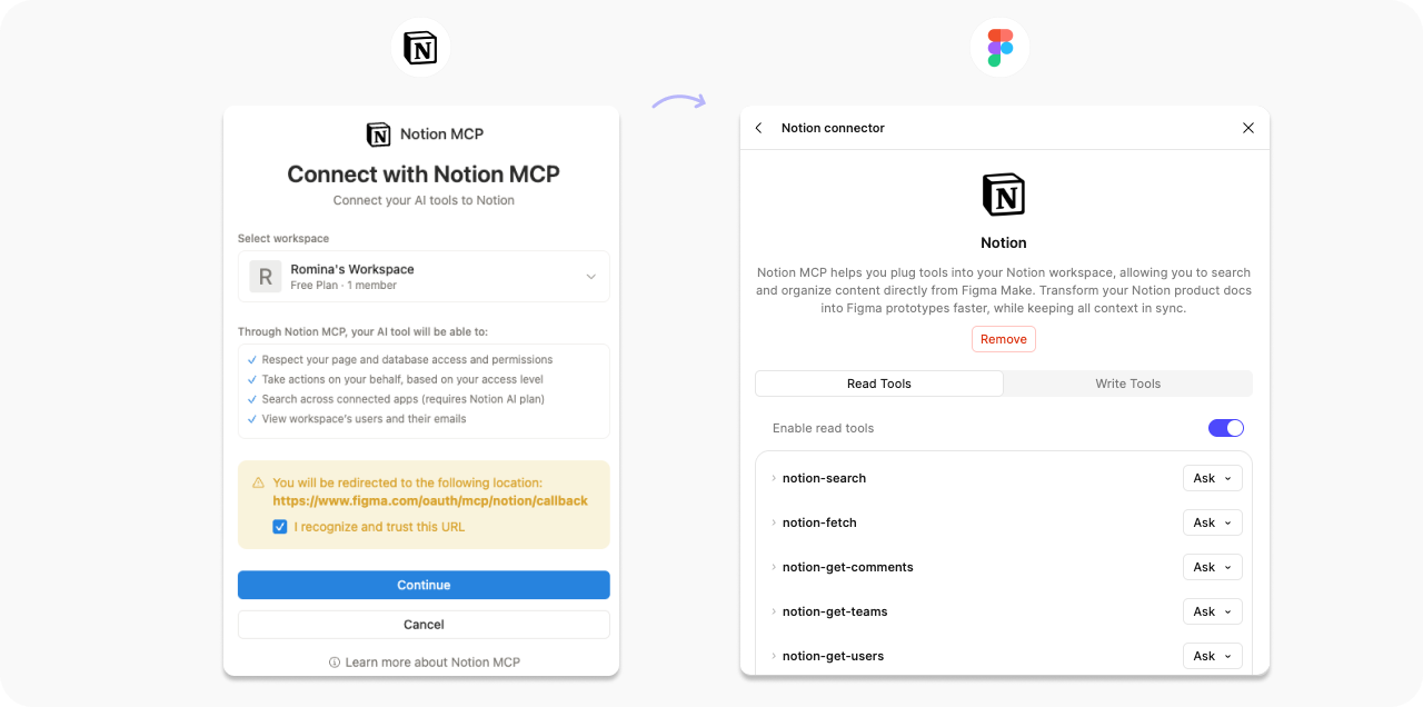
Prompt
“Use the specs in [Notion page link] to create a first-draft prototype. Follow the user flow described in the PRD and use my
ButtonandInputcomponents. Include the error states listed in the acceptance criteria.”
Example: Mobile learning flashcard app (simple)
This is a great “start here” project. It is mostly UI and local state, which means you can validate the flow quickly.
Example prototype: 🔗 Mobile Learning Flashcard App (Figma Make)
What this is great for:
Validating the core flow (browse decks, study, progress).
Iterating on hierarchy, copy, and interaction.
Stress-test empty, completed, and error states before wiring real data.
How to move faster with Notion :
Put your decks and cards in Notion, then connect Notion in Figma Make and pull the content in as context.
This lets you prototype with real copy and structure while editors keep the source of truth in Notion up to date.
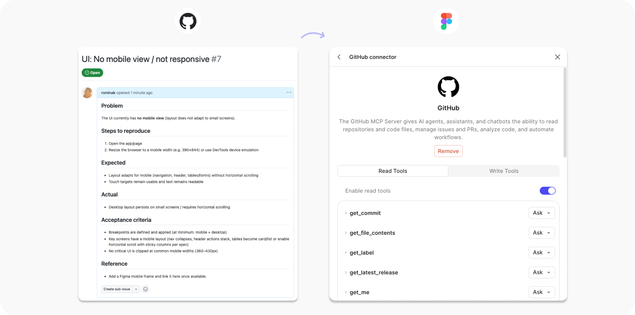
Example: Create or update a prototype from a GitHub issue
Prompt
“Fetch the requirements from [GitHub issue link]. Build a prototype that satisfies the user story. Include the edge cases and error states mentioned in the acceptance criteria.”
Connector permissions (what I recommend)
Figma disables write tools by default for good reason.
Keep write tools on Ask to run until you trust the workflow.
Enable only the connectors relevant to the current project.
Using API integrations
Live data prototypes expose content length, edge cases, and failure states.
Use live data when you need to validate:
Real content density and truncation.
Empty and loading states.
Error handling.
How your UI behaves with real user data.
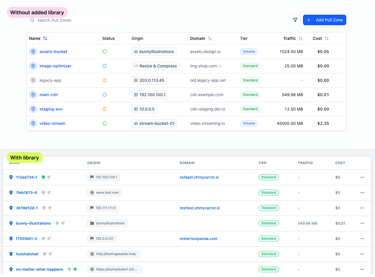
Example: Illustration gallery (Supabase + external API)
This is the “real app” pattern: you store metadata in a database and serve images from a CDN. And wohoo, it works in Figma, too. ✨
Example prototype
Architecture:
bunny.net hosts the image files (CDN delivery) → Imagine it like a “Dropbox folder”. You can use any other CDN provider as well.
Supabase stores the metadata (title, tags, dimensions, URLs, created_at).
The prototype fetches records from Supabase and renders thumbnails from Bunny URLs.
Other possible examples for using the API
Theme previewer: fetch brand themes (colors, typography scales) from an internal theming API and preview the same screen across themes.
Support ticket patterns: pull top support topics from Zendesk and map them to components (“most complaints mention DatePicker”) to guide fixes.
How to set up API integrations (a checklist)
Start with public endpoints or a simple API key.
Define the data shape you expect (fields and types).
Ask for loading, empty, and error states.
Iterate and add more prompts
Phase 5: Output options
Option 1: Stay in Figma
Use this when you:
Need stakeholder buy-in.
Need to test flows.
Still expect the design to change.
Option 2: Export code as a reference
Use this when you:
Want devs to understand the interaction and structure.
Want a concrete artifact for implementation discussions.
Treat the export as a reference, not production code.
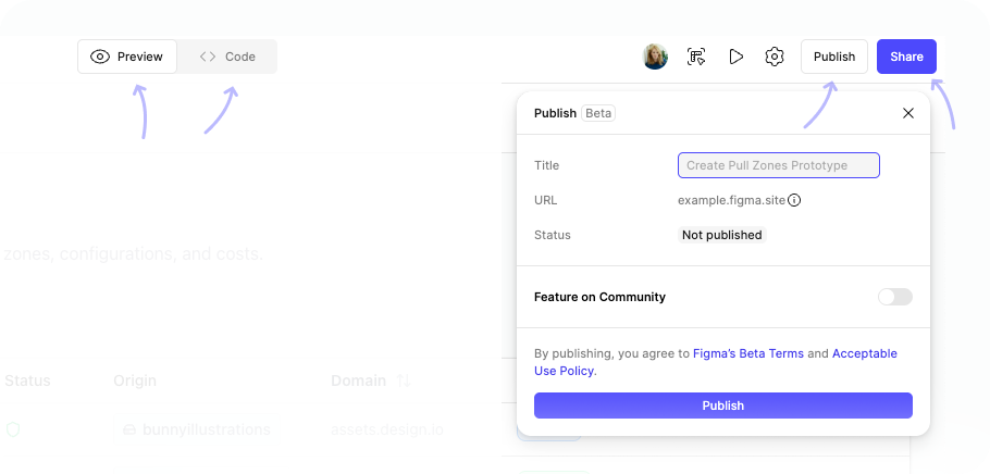
Option 3: Publish as a standalone demo
Use this when you:
Need a link for remote stakeholders.
Want a demo that behaves like a real app.
Want to share it under your own domain.
My tips for Figma Make
Create reusable templates you can copy and paste. Save context blocks, data shapes, and state requirements, so you stop rewriting the same instructions.
Establish foundational rules and save them as markdown. Reuse the same constraints at the start of every new Make session.
Define structure, not just tasks. Tell the tool what the app is made of (screens, states, data model), not just what it should do.
Refine the design before you prompt. Start with a decent layout and reusable components. The more solid your structure is, the less you fight the AI.
Reference your exact component names. Use the names exactly as they appear in Assets so Figma Make uses the right building blocks instead of inventing new UI.
Connect your team library first. Do this before you prompt; otherwise, you will spend the session undoing generic components.
Set up connectors before prompting. Get access set up first so context is ready, then focus prompts on screens and states instead of setup.
Create a global CSS file you can reuse. Use it for published demos so typography, spacing, and layout defaults stay consistent across screens.
Start with short prompts, then iterate. Change one thing at a time so you can see what caused the shift.
Use revert as a workflow tool. Try an idea. If it drifts, revert. Prompt again with tighter constraints.
So, when to use Figma Make?
Figma Make fills a gap most teams feel: fast prototyping that stays consistent with your design system.
Use Figma Make when:
You already have a component library and variables in Figma, and you want the prototype to reuse them.
You need to validate a flow with realistic states (loading, empty, error, success), not just a static mock.
Your content or requirements live in tools like Notion or GitHub, and you want to pull them in rather than copy-paste.
You want to iterate directly in Figma (auto layout, variants, copy edits) after the first draft.
You want a shareable demo link for stakeholders, including on your own domain.
If you want to try it today, do this:
Create an account (if you are late to the party 🙃)
Open a file connected to your team library.
Prompt using your real component names.
Demand loading, empty, and error states.
Iterate in small steps until the prototype looks and behaves like your product.
More Figma links to explore

🔗 Connect external tools using Figma Make connectors
Official documentation on MCP connectors
🔗 6 Winning Figma Makes and what you can learn from them
🔗 What’s new from Config 2025
Official Figma announcement covering Make features
🔗 Figma AI agent workflow builder
Figma’s documentation on AI workflows
🔗 Empowering designers: AI, design systems, and quality
Schema by Figma 2025
Enjoy exploring and let me know how it goes. 🙌
Romina
— If you enjoyed this post, please tap the Like button below 💛 This helps me see what you want to read. Thank you.
💎 Community Gems
Into Design Systems Conference 2026 / AI + Design Systems
2026 will be a turning point for our field! If you want to understand how top teams build worldwide AI-ready Design Systems, this conference is the place to learn.
I will also talk there. 🙃
🔗 Link
Intercom’s 3-point framework for AI-driven design
Shipping code, vibe coding the roadmap, and owning the entire frontend
🔗 Link
Designing AI for Collaboration: The Future of Work is Multiplayer
from Salesforce
🔗 Link
Thanks for sharing! Great article. Have been exploring using Figma Make for the past few weeks where I am trying to get Make to give output that aligns with our design system. And it’s been quite a challenge. Just ‘exporting library to Make’ hasn’t helped. What you mentioned as tips have become essential in order to get Make to create outputs that are aligned with our design system.
Here’s what I did:
1. Exported each component’s usage guidance(existed in Figma Library as frame) and specs as markdown and put that in Guidelines folder
2. Created a very comprehensive guidelines.md file that highlighted exactly what should it do when a figma frame is attached to the prompt, and when it’s not attached.
3. Responsiveness-related information for how content and components wrap and respond was included in another markdown file.
4. I also asked Make to first evaluate which components are being requested in the prompt or are used in attached Figma frame, and only look up guidelines of those components to save on tokens and time taken to generate outputs. ( I thought Make should’ve done this by default)
5. Generated globals.css outside of Make (in Cursor) with help from Figma MCP because the css file inside the Make file was nowhere close to the variables and styles in the attached library.
6. In spite of all this, there were syntax errors and challenges with the output coming from Make.
So, in my experience so far, design system owners should focus on creating a good template file (by doing all of the steps above) and let the DS consumers use that as a starting point to start prototyping. Else we will see consumers using up all their tokens just to get paddings or hover states right instead of exploring UX options.
Awesome article Romina! I started playing around with Figma Make following your article and tried to prompt using my library. Somehow I'm noticing Figma Make doesn't see/understands how the variants of a component look like? I was wondering if you paste every single variant into the prompt to give it as a context?
Cheers!