

Figma File Organization: What Performs Best
Compilation of my tips

👋 Get weekly insights, tools, and templates to help you build and scale design systems. More: The Design System Guide / Podcast / My Linkedin
Figma File Organization: What Performs Best

TLDR:
Slot components make everything complex
Widgets are useful
Simplify components
One component per file
Here's my experience organizing Figma files. I'll share what works for me, what doesn't, and why.
The biggest issue isn't complexity - it's performance and findability. When files get slow, or team members can't find what they need, productivity drops dramatically.
What's important:
➡️ Smart Cover Pages Save Time
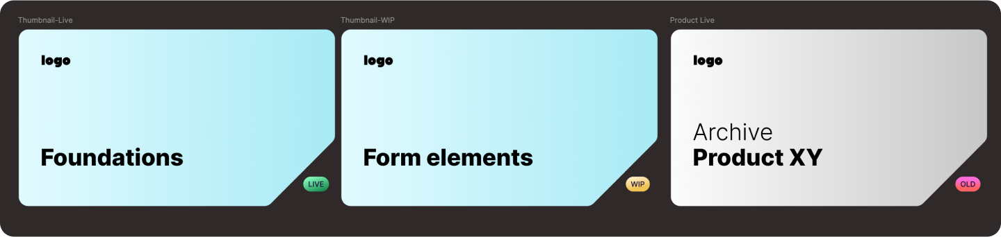
Use visual cues:
Add statuses (WIP, Live, Archive)
Product logos for quick recognition
Bg colors for components vs screens, etc.
➡️ Create a Table of Contents
Create a "Start Here" file or page with:
Links to all important pages, screens, files
Links to external docs (Storybook, documentation)
Team for each product
Research links
Why? Non-designers need this the most. I learned this after watching developers spend 15 minutes trying to find a simple button component and navigate infinite canvas.
➡️ File Performance
For Small Teams (Under 10 People)
Bad example:
All components elements on one page (slow and hard to find) 👇
Good example:
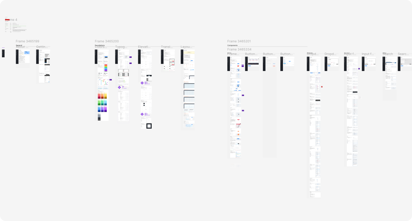
One component per page.
UI kit on one page -> where you show all the existing components (take it as your showroom).
Yes, it means more pages. But it will be easier to navigate. Keep the structure dead simple:
📦 Brand X
UI Kit (merged components)
— — Buttons (component per page)
— — Form elements
— — Cards, etc.
Icons
Archive
That's it. Don't overcomplicate it.
Multi-brand
Keep one component per file (best for performance, less mistakes)
Create a UI kit/Brand library
Create a Foundations file (all your design options - colors, spaces, … )
Create a Foundations file + Semantic file (if you use Figma Variables)
How you structure Figma also depends on your tech stack (Figma Variables vs design tokens). In the upcoming newsletters, I will demo more workflows (startups vs multi-brand design systems). But for now, here's how I recommend choosing:
For startups just beginning: Focus on what’s most efficient.
One brand with two themes: Figma Variables.
Multi-brand: MVP, evaluate Tokens Studio - it handles multi-brand complexity better.
For enterprises with dev resources: Consider Figma Variables via API (+ custom plugins) or Tokens Studio, depending on your tech stack.
Example structure
📦 Brand X
— — Foundations
— — Component X (one per file)
— — Accordian
— — Button
— — etc.
— — Patterns/templates
— — Projects
Archive
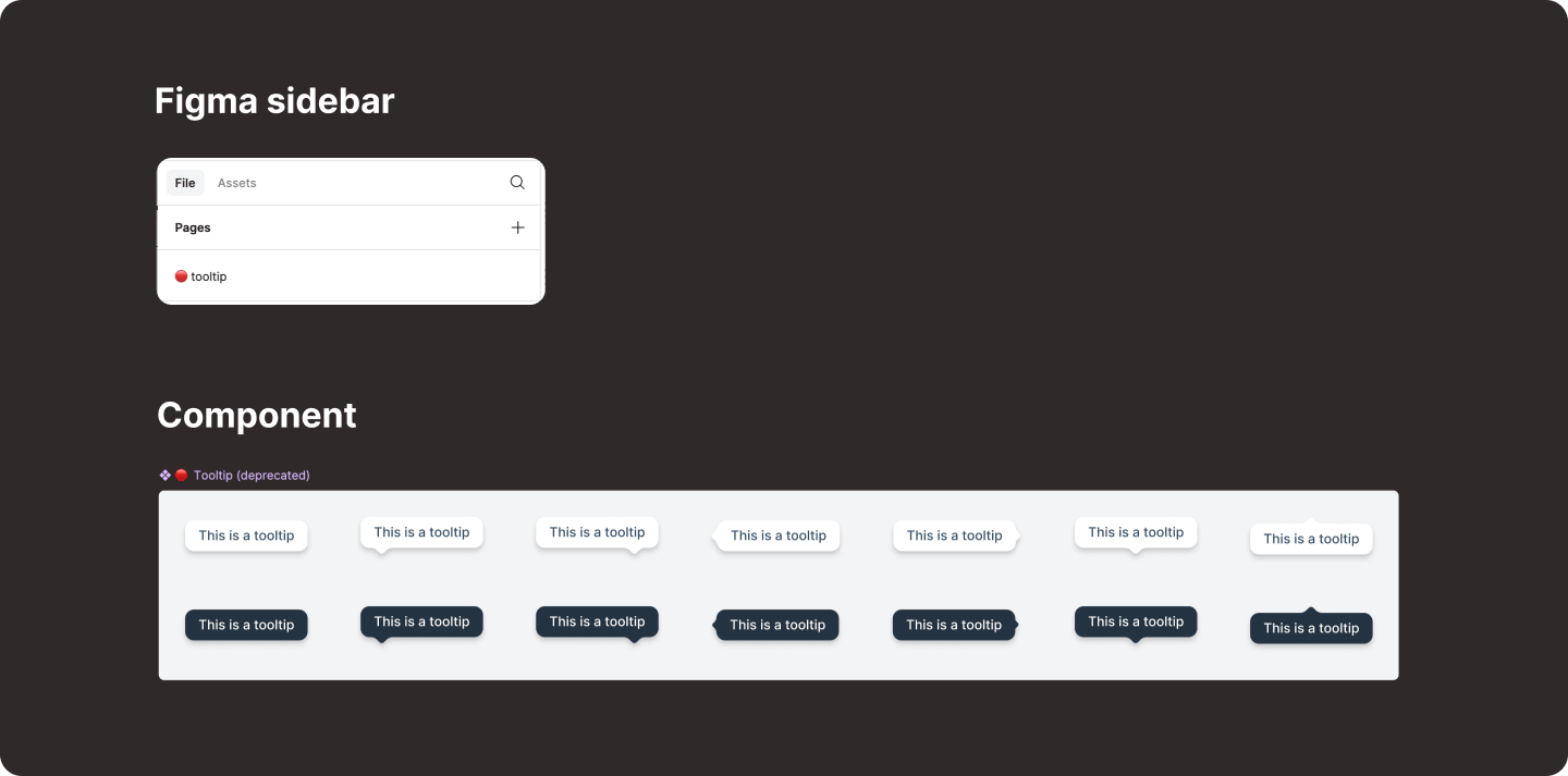
➡️ Slot components bring complexity
Potential Misuse: Without proper documentation, there's a risk that team members might replace slots with inappropriate components, leading to inconsistencies (different spacing, hierarchy)
Complexity: In such cases, using variants might be more appropriate.
➡️ Design System Inventory Sync
When I start the project, I create a list of components and statuses. Later, I add a list of design tokens and sync all the values. If you want to see the same status in Figma, you have two options:
Airtable → Figma
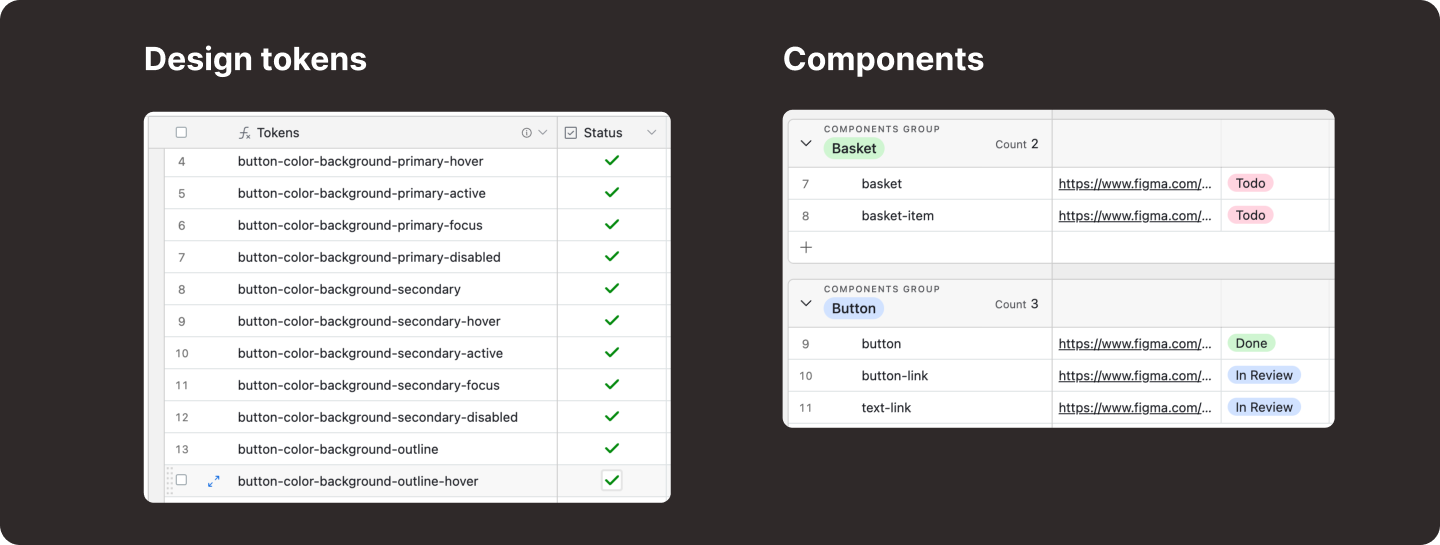
Use the DataPocket plugin if you need live updates in Figma.
PS. You can also add a status table to your documentation page. Live example from Orbit.
Google Sheets → Figma with Widget: Table
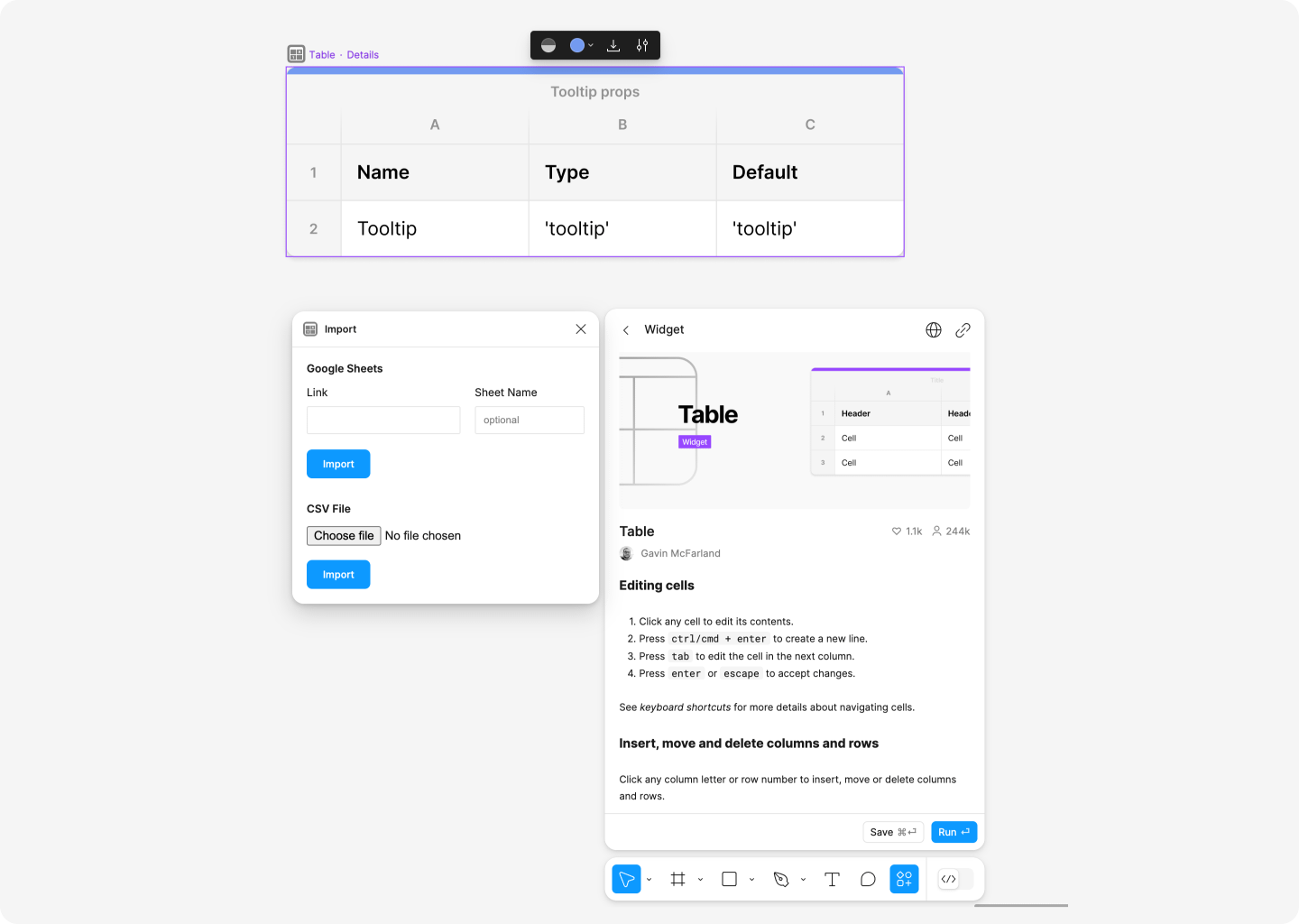
If you have your inventory in Google Sheets, you can import data from Google Sheets or a CSV file. Click on the widget name and choose Import. Now you have an overview.
➡️ Deprecated Components
Add a red circle to the name. Simple visual cue that says, "Don't use this."
➡️ Patterns
Instead of complex nested components, create a "Patterns" page showing how to combine components. Way easier to edit and add more when needed.
➡️ Figma Documentation
Use sticky notes right in Figma. Not fancy, but everyone understands them.
You can also use my template Design Documentation template for more ideas.
➡️ Figma Features
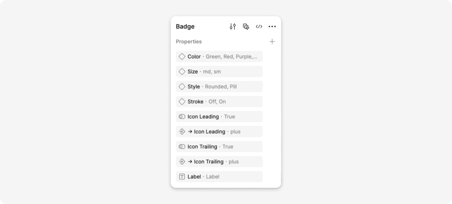
Keep your component properties (boolean, props, descriptions) simple and aligned with your codebase. This matters for two key reasons:
Performance: Too many variants can slow down your Figma files significantly. Stick to properties you actually need.
Developer Handoff: Match your property names with your code components. When your Figma props mirror the code props, developers can work faster and with fewer questions.
Example: If your React component uses size="small" and variant="outline", use the same naming in your Figma component properties, not type="bordered" or style="tiny".
➡️ Archive old stuff
Never delete. Create an Archive project and move old stuff there.
➡️ Component Naming
Check components.gallery for standard naming patterns.
Find what works for you
The best system is the one your team uses. I've seen beautiful, complex organization systems fail because they were too complicated.
Start simple. Stay practical. Evolve when needed.
Let’s go 🚀
💎 Community Gems
It counts layers (Figma Plugin)
by PJ Onori
🔗 Link
Coral UI Core 🪸
A collection of utility classes and components for building Coral UI
by Drew Minns
🔗 Link
❤️ People to follow
This week, I would like to introduce you to Ben Callahan. Ben Callahan is a Design System Consultant and owner of Sparkbox. He runs "The Question," a community project focused on collaborative learning.
Hi Romina, you recommend keeping one component per file for the multi-brand. How do you handle updates? eg an update in the button component would mean opening and updating all component files which contain a button in the layout (button group, modal, card, …). I only did a poc and found that time consuming and difficult to keep the overview which component is included in other components. curious to hear your thoughts or best practices !