

Design tokens that AI can actually read
Plus a behind-the-scenes BMW experience

👋 Get weekly insights, tools, and templates to help you build and scale design systems. More: Design Tokens Mastery Course / YouTube / My Linkedin
Most design tokens are structured for humans using Figma or JSON files. When you connect them to Claude via MCP (Model Context Protocol), the AI sees a wall of nested objects with no context about why these values exist or when to use them.
The result: AI generates code with blue-5 when it should use color-feedback-error. It picks space-3 for the button padding when your system specifies button-padding. You spend more time typing prompts to fix and explain than you do actually saving with AI.
Here’s how to restructure your tokens so AI actually understands your design system.
What you’ll learn
Why tokens fail AI
The three elements of AI-readable tokens
Add descriptions to your top 10 tokens in 15 minutes
How to add context without restructuring legacy tokens
Catch token misuse in Figma
How AI-readable tokens enable context-aware design systems
The problem: tokens that lie
👋 Just a quick note → I’m mostly using Claude Code or Cursor, so I will write about this tool, but you can use other tools as well. However, keep in mind that the model you pick also affects what you get in the end.
I connected my design tokens to Claude via Figma MCP. First test: “Build me a button component using my design system.”
Claude’s output used:
red.6for the error state (should becolor-feedback-error)space-2for padding (should bespace-4)neutral-7for text (should be a semantic token)
The tokens were technically correct. They existed in my system. But Claude had no way to know that red-6 is a primitive meant for building semantic tokens, not for direct use in components.
Here’s what Claude saw:
{
  “red”: {
    “6”: {
      “value”: “#DE3E25”,
      “type”: “color”
    }
  }
}
What was missing: the semantic layer.
If you use Tokens Studio or Figma Variables, you already create primitive tokens like red-6 and then connect them to semantic tokens like color-feedback-error. But many teams either skip the semantic layer entirely or don’t expose it to AI tools.
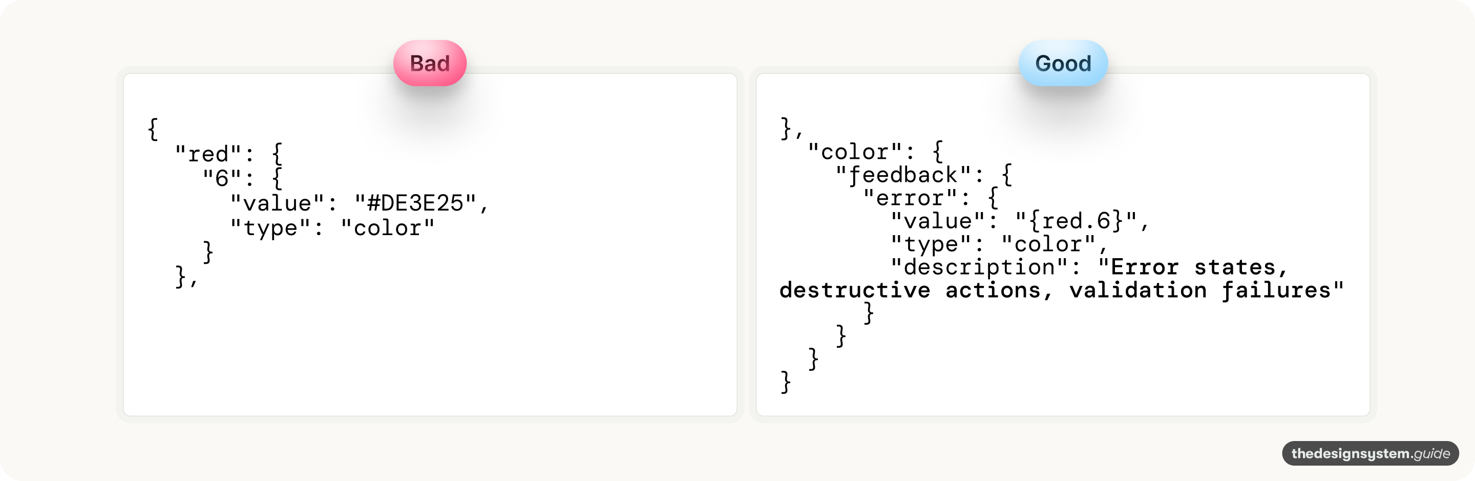
Here’s what Claude needs to see:
Same underlying hex value. But now AI tool sees the primitive, the semantic token that references it, and the description that explains intent.
Why are tokens the foundation
Design tokens sit at the bottom of the stack. Every component, pattern, and product page ultimately resolves to tokens. This makes them both the smallest unit of your design system and the highest-leverage place to add AI readability.
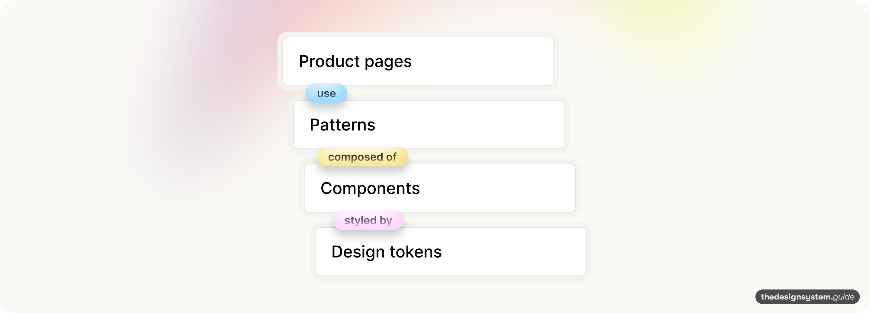
If tokens lack intent, everything above them inherits that blindness.
When Claude generates a Button component, it needs to pick colors, spacing, and typography. If your tokens are just primitives (red-6, space-4), Claude makes arbitrary choices. Those choices cascade upward—into patterns, into pages, into your product.
But if your tokens carry intent (color-feedback-error, spacing-component-button-padding), Claude’s choices are informed at every layer. The Button uses the right error color. The Form pattern that contains the Button inherits that correctness. The Settings page that contains the Form stays consistent.
Tokens are the API contract between design and code.
Think of tokens as the interface definition for your visual language. Just like a well-documented API tells developers what each endpoint does and when to use it, well-documented tokens tell AI what each value means and where it belongs.
// A bad API
GET /data/123  → What is this? When do I call it?

// A good API
GET /users/{id}/profile  → Clear intent, obvious usage
The parallel is exact. Tokens without intent are like undocumented endpoints: technically functional but impossible to use correctly without tribal knowledge.
🚨 Tokens are the only layer AI always touches
When Claude generates code, it might skip your component library entirely and build from scratch. It might ignore your patterns. But it cannot skip tokens (every visual property resolves to a value).
This makes tokens your guaranteed point of influence. Even if Claude improvises everything else, AI-readable tokens ensure the fundamentals are correct: the right colors for the right states, the right spacing for the right contexts, the right typography for the right hierarchy.
Start with tokens because they’re the smallest, fastest fix with the largest impact.
You can’t restructure your entire component library overnight. You can’t document every pattern in a week. But you can add descriptions to your top 20 tokens in an hour.
That hour of work propagates upward through every component and pattern that uses those tokens. It’s the highest-leverage investment you can make in AI readability.
What makes tokens AI-readable
AI tools process your tokens differently than humans do. A designer browsing your token file understands context from experience. They know red means danger. They know primitives are building blocks, not final values.
AI has none of that context. It sees names and values. That’s it.
When you expose tokens via MCP, Claude accesses them through tool calls. It retrieves your token file and parses the JSON. The structure and descriptions you add are exactly what Claude reads—nothing more, nothing less.
Three things make tokens AI-readable:
1. Semantic naming (intent, not appearance)
blue.5 = color.interactive.primary
space-4 = spacing.component.button.padding
The AI-readable version tells Claude what the token is for, not just what it looks like.
2. Descriptions (when to use this token)
{
  “color-feedback-error”: {
    “value”: “#DE3E25”,
    “type”: “color”,
    “description”: “Use for error messages, destructive button backgrounds, invalid input borders”
  }
}
That single description field transforms a color value into actionable guidance. Claude now knows this token belongs on error states, not primary buttons.
3. Relationships (which tokens are connected)
{
  “color-feedback-error”: {
    “value”: “#DE3E25”,
    “type”: “color”,
    “description”: “Error state background”,
    “usage”: [”Alert.error”, “Button.destructive”, “Input.invalidBorder”],
    “pairedWith”: [”color-feedback-errorText”, “color-feedback-errorIcon”]
  }
}
Now Claude knows that when it uses this error background, it should also look for color.feedback.errorText for the text color.
The before and after
Let me show you what this looks like with real tokens.
Before: primitive-based structure
This is a typical Tokens Studio export:
{
  “red-1”: { “value”: “#FAEFEC”, “type”: “color” },
  “red-2”: { “value”: “#F9E6E2”, “type”: “color” },
  “red-3”: { “value”: “#F7D5CD”, “type”: “color” },
  “red-4”: { “value”: “#F6BFB1”, “type”: “color” },
  “red-5”: { “value”: “#F6A791”, “type”: “color” },
  “red-6”: { “value”: “#DE3E25”, “type”: “color” },
  “red-7”: { “value”: “#C42924”, “type”: “color” },
  “red-8”: { “value”: “#841815”, “type”: “color” },
  “space-4”: {
    “value”: “{space-1} * 4”,
    “type”: “spacing”,
    “description”: “20px”
  }
}
Hard to know which token to use for error states, right?
{
  “color-feedback-error”: {
    “value”: “#DE3E25”,
    “type”: “color”,
    “description”: “Error states: alerts, destructive buttons, invalid inputs”,
    “a11y”: “Meets WCAG AA contrast on white (4.5:1)”
  },
  “color-feedback-error”: {
    “value”: “#FAEFEC”,
    “type”: “color”,
    “description”: “Light error backgrounds for inline validation”
  },
  “color-feedback-success”: {
    “value”: “#198053”,
    “type”: “color”,
    “description”: “Success states: confirmations, completed actions”
  },
....

and so on ...
What Claude now understands:
color-feedback-erroris for error statesIt meets accessibility requirements
color-feedback-errorexists for lighter backgroundsspacing-component-button-paddingis specifically for buttonsspacing-component-input-paddingis for inputs (different value)
Want to know if your tokens are AI-readable? Run this test

Prompt Claude/Cursor (make sure you connect Figma MCP first):
“Build a form with email validation that shows an error state when the email is invalid. Use my design system tokens.”
If your tokens are NOT AI-readable, Claude will:
Use primitive colors like
red-6or#DE3E25directlyPick arbitrary spacing values
Ignore accessibility considerations
If your tokens ARE AI-readable, Claude will:
Use
color-feedback-errorfor the error borderUse
color-feedback-errorfor the backgroundUse
color-text-errorfor the message textApply
spacing-component-input-paddingcorrectly
The difference is obvious. And it saves you from playing token police on every AI-generated component.
Quick exercise: add descriptions in 15 minutes
You don’t need to restructure your entire token system today. Start with descriptions.
Step 1: identify your top 10 tokens
Which tokens appear in the most components? Probably:
Primary button color
Error color
Text primary color
Background color
Border color
Button padding
Input padding
Border radius
Focus ring color
Disabled state color
Step 2: add descriptions
Open your token file. Find each token. Add a description field:
{
  “blue-5”: {
    “value”: “#1870C6”,
    “type”: “color”,
    “description”: “Primary interactive color. Use for main CTAs, links, and focus states. Meets WCAG AA on white.”
  }
}
Step 3: test with Claude or Cursor
Ask your AI tool to build something using your tokens. See if it picks the right ones.
Wohoo, I hope it works.
The companion file strategy
If you can’t change your token structure, companion files are your best option. They add the context AI needs without touching your existing tokens.
Create context files that MCP loads alongside your token data.
Examples:
token-usage-guide.md
# Token usage guide

## Color hierarchy

### When to use feedback colors
- `color-feedback-error`: Form validation failures, destructive actions, system errors
- `color-feedback-success`: Completed actions, positive confirmations
- `color-feedback-warning`: Cautions, pending states, non-critical alerts

### When to use interactive colors
- `color-interactive-primary`: Main CTAs, links, focused elements
- `color-interactive-secondary`: Secondary actions, less prominent buttons

## Spacing rules

### Component padding
- Buttons: Always use `spacing-component-button-padding` (20px)
- Inputs: Always use `spacing-component-input-padding` (15px)
- Cards: Always use `spacing-component-card-padding` (24px)

### Never do this
- Don’t use primitive spacing values directly in components
- Don’t mix spacing scales (e.g., 8px grid with 5px values)
component-token-map.md
# Component token mapping

## Button
- Background: `color-interactive-primary`
- Background hover: `color-interactive-primary-hover`
- Text: `color-text-on-primary`
- Padding: `spacing-component-button-padding`
- Border radius: `border-radius-md`

## Button (destructive variant)
- Background: `color-feedback-errorDefault`
- Background hover: `color-feedback-error-hover`
- Text: `color-text-on-error`

and so on ...
When you add these files to your MCP server, Claude reads them alongside your tokens. It has the rules, not just the values.
This approach works even if your tokens are primitive-only. The companion files provide the semantic layer externally.
Advanced: the token metadata layer
For teams ready to go deeper, add a metadata layer that explicitly tells AI how to use your tokens.
{
  “color-feedback-errorDefault”: {
    “value”: “#DE3E25”,
    “type”: “color”,
    “meta”: {
      “description”: “Primary error state color”,
      “usage”: [
        “destructive button backgrounds”,
        “error alert borders”,
        “invalid input borders”,
        “error icon fills”
      ],
      “doNot”: [
        “use for warnings (use color-feedback-warning)”,
        “use on dark backgrounds without checking contrast”,
        “use as text color (use color-text-error instead)”
      ],
      “pairedTokens”: [
        “color-feedback-errorSubtle (for backgrounds)”,
        “color-text-error (for text)”,
        “color-feedback-errorHover (for interactive states)”
      ],
      “a11y”: {
        “contrastOnWhite”: “4.52:1”,
        “wcagLevel”: “AA”,
        “notes”: “Do not use as text on dark backgrounds”
      },
      “components”: [”Button”, “Alert”, “Input”, “Toast”]
    }
  }
}
Yesss, I know that this is more work upfront. But Claude now has everything it needs:
What this token is for
Where to use it
Where NOT to use it
What other tokens it can combine with
Accessibility requirements
Which components use it
Why this matters beyond AI
Making your tokens AI-readable also makes them human-readable. The documentation you add for Claude helps:
New team members understand your system faster
Designers make consistent choices without asking
Developers pick the right tokens without guessing
Audits catch incorrect token usage automatically
The work you do for AI benefits everyone.
Validating intent at the source
The same problem exists upstream. Before tokens reach AI, designers misuse them in Figma. They apply blue.500 directly to a button instead of color.interactive.primary. They use error colors on non-error components.
I was experimenting with different ways to educate teams about design tokens, and I built a Figma plugin called Token Intent Validator that catches these issues at the source.
What it catches:
* Recommends appropriate semantic tokens based on the layer’s context
* Detects when you use raw hex color -> One click “Apply” button for the suggested design token
* Flags primitive tokens
* Identifies intent-property mismatches
* Suggests text style tokens
* Show confidence level for each suggestion
* Connects with AI and gives a chat interface (you can connect any model)
* It’s context-aware
* Recommends tokens based on your codebase/Figma library
* Analyzes the document’s structure
* You can validate the selection or the whole page
I still have to improve some parts, but it is already valuable.
Your path to context-aware design systems
AI-readable tokens are the foundation of something bigger: the context-aware design system. 😊
When your tokens include intent, not just values, you unlock:
Intelligent suggestions
Automatic consistency
Usage analytics
Cross-tool validation
Okay, so your first goal is simple → start with descriptions. → test with Claude → iterate based on what the AI gets wrong.
Let me know how it goes. 🙃
Have a great weekend,
Romina
— If you enjoyed this post, please tap the Like button below 💛 This helps me see what you want to read. Thank you.
BMW Group invited me for an exclusive iX3 driving experience a few weeks ago. I expected a car launch. I got a masterclass in design. 😍 After two days with the engineers, designers, and leaders of Neue Klasse, I see why legacy brands still succeed.

↪️ The iX3 is the first with the new design language
You feel the shift immediately.
* Large monolithic surfaces
* Clean geometry
* No unnecessary noise
The philosophy is simple: reduce complexity so character can shine through.
↪️ A shift from static assets to dynamic elements.
Instead of metal accents, BMW is using digital light signatures to define identity.
The kidney grille. The four-eyed face. The depth effect.

↪️ The interior feels like a living room
* Panoramic iDrive stretching across the full width
* Wrap-around effect that feels calm, not cluttered
* Textile on the dashboard with a light effect
✨ From a systems perspective, the iX3 is a leap
* Personalized dashboards
* Haptic buttons
* Integrated AI
* Panoramic iDrive with AR clarity
* Driver Assistance
* Superbrain Computing: 20x more power for smarter decisions
* Modular OS: scalable, secure, future-proof

👆 Me trying to be faaaast on the Ascari motor racing circuit
↪️ Going backstage
BMW team is curious and deeply committed. They listened, cared, and shared everything openly.
As someone who works in design every day, that mindset hits home. You can feel it in the product.
I told my family that life would never be the same. Now, I will always compare everything to this car.
Design is not a department. Design is a mindset.
BMW proves my belief: the best products aren’t just designed to look good. They feel designed in every aspect.
I left inspired. Not just by the new BMW iX3.
But by the people building it. 💙
PS. You can see the video on my LinkedIn post →
💎 Community Gems
✨ Documenting Design Systems - Architecture Decisions Record with Claude Desktop from Sam I am Designs 🫶 🇨🇦
Gamma AI
AI tool for making presentations.
🔗 Link
Great analogy of API design. Curious if you explored the translation layer between defining the product philosophy and principles to the tokens themselves? I’ve been playing around with an AI Agent that defines the philosophy and principles from a project brief and PRD and then also translates this to tokens.