

Design Systems That Document AI
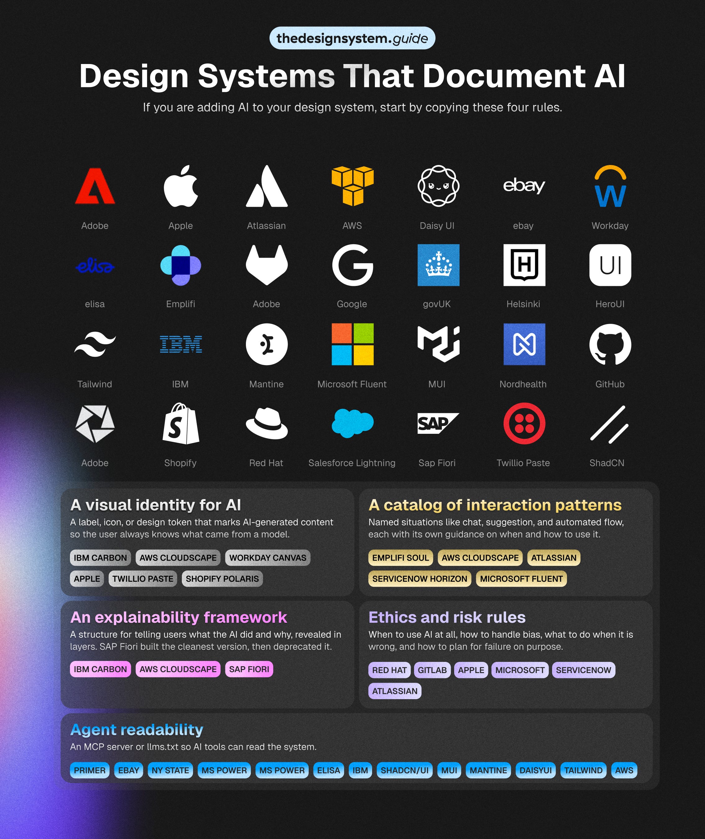
26 design systems to learn from

👋 Get weekly insights, tools, and templates to help you build and scale design systems. More: Design Tokens Mastery Course / YouTube / My Linkedin

I spent a week reading every public design system I could find that documents AI. Out of 156 systems in my dataset, 26 now address it in some form: an AI label, a chat pattern, an explainability framework, or a set of ethics rules. That is up from the handful you would have found a year ago, and it is climbing fast.
The interesting part is not the count. It is that the teams doing this well have never coordinated, and yet they keep arriving at the same four rules. IBM, AWS, GitLab, Red Hat, SAP, Workday, Apple. Different companies, different industries, different component libraries, and a similar rulebook. That convergence is the most useful signal in the dataset, because it tells you which AI guidelines are becoming conventions and which are still one company’s experiment.
What AI readiness actually means
For this piece, AI readiness means how well a public design system helps teams design, explain, govern, and scale AI-powered experiences. It measures the published system, not the company behind it. Apple shipped Apple Intelligence long before its guidelines documented generative AI.
The AI-readiness maturity model
Level 0: No visible AI layer
No public AI guidance at all. 130 of the 156 systems sit here, which leaves every product team to work AI out alone.
Level 1: AI as decoration
Shopify Polaris marks AI with a “Magic” color role and tokens like --p-color-bg-surface-magic. You get a recognizable signal and nothing about behavior. Mark only, and the ceiling is a purple badge.
Level 2: AI as a component
IBM Carbon ships an AI label that opens an explainability popover, reused across 13 components. Teams stop rebuilding the badge and the chat panel. A component library still cannot say when AI should act, when it should wait, or when a human takes over.
Level 3: AI as an interaction pattern
Atlassian publishes interaction guidelines for how AI should suggest, respond, and hand off inside a workflow. Designers and PMs get the behavioral decisions, not just the UI. The risk is patterns that float free of governance, metrics, or code.
Level 4: AI as governance layer
Microsoft Fluent 2 turns governance into enforcement: a Responsible AI rubric with letter grades and automatic fails, plus a page that governs the AI’s own tone and guardrails. The payoff is accountability. The catch is governance that never connects back to a reusable pattern.
Level 5: AI as system infrastructure
Microsoft Fluent is the only strong public signal here: a named “Copilot UI Kits” tier of AI components across Web, iOS, and Android, aligned to code. A kit that extends the core beats any principles page. Almost no one reaches this rung, because everything past that one table stays private.
Reading the ladder
The jump that matters is 2 to 3, the line between a system that styles AI and one that helps you design how it behaves. That is the model. Now the scores, because the ranking is not the one you would guess.
The scorecard
I scored the systems that document AI on five dimensions, twenty points each: how they mark AI, whether they ship reusable AI components, whether they document how AI behaves, whether they govern it, and whether they wire it into infrastructure.
It measures the depth of public documentation, not the quality of the company’s actual AI.
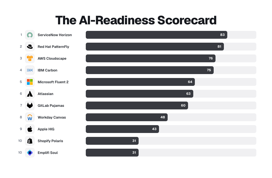
ServiceNow ships a full “Designing for AI” section, an “Identifying AI content” page, a ten-question value gate that opens with “Is AI really needed to solve the problem,” and a downloadable responsible-AI handbook. Red Hat PatternFly ships an actual npm ChatBot library with AI-labeled messages, citation tiles, feedback forms, streaming, and conversation-history error states. Quiet, enterprise, unglamorous, and ahead of everyone.
The household names sit low, for an honest reason. Apple has the best responsible-AI writing in the set and zero reusable components, because Apple ships frameworks, not a public component library, so it scores 43. Shopify has the cleanest AI marking tokens anywhere and almost no behavioral guidance, so it scores 31. High brand, low documented depth.
SAP did the work, then took it offline. It built a full AI and Joule design practice and published a lot of it openly, but those pages now return errors after a guidelines refresh. That is why it is not in the top 10: the thinking is not gone, the public just cannot read it anymore.
🚨 One honest limit before the rules.
This measures public documentation, and public is not the same as capable. A low score means a team has not exposed its AI thinking to the outside world, not that the thinking does not exist. Carbon’s deeper AI guidance sits behind “IBMers only” links. Atlassian gates its AI Figma libraries to Atlassians. Apple shipped Apple Intelligence across its platforms for a year before its public guidelines documented generative AI. The AI work inside these companies is almost certainly larger than what their design systems publish. What I am scoring is the generosity and discipline shown in the open, which is the only part another team can learn from.
Whatever level a system reaches, the ones worth copying share four rules. They are what good looks like from Level 2 up, and they are drawn from reading all 26 side by side.
Rule 1: Mark it, every time
The user must always know when content came from a model.
IBM’s Carbon for AI is the most developed example. IBM built an entire extension of Carbon whose core is the AI label, an interactive marker that sits inside any element containing AI-generated content. The label is also the doorway to an explanation, which I will come back to.

The rule Carbon writes is a restriction, and that is what makes it a real guideline:
“Don’t use the Carbon for AI styling as decoration. While these new styling elements are enticing, they are strictly intended to identify any instances of AI being used in an experience.”
AWS Cloudscape reaches the same place from a different angle. Its generative AI output label is a small “Generated by AI” tag with a sparkle icon, and the guidance reserves that icon with unusual strictness:
“Sparkle icon should not be used in any other labels other than generative AI output. Don’t use this label for outputs produced by other forms of AI that are not generative.”
Cloudscape even tells you not to over-mark: in a list where every item is AI-generated, label the group once, so users are informed without being overwhelmed.
GitLab Pajamas writes the same rule as ready-to-paste copy. Flag AI content with a “Generated by AI” or “Summarized by AI” disclaimer, and pair it with a verification nudge: “Content generated by AI should be seen as a starting point and verified before use,” or where space is tight, simply “Verify before use.”
Workday Canvas turns marking into infrastructure, shipping an AI badge, an AI button, and dedicated AI color tokens so the mark is consistent by default.
The shared rule: AI content is always labeled, the label is consistent, and the styling is reserved for AI alone.
Rule 2: Explain it, in layers
Marking tells the user that AI was involved. Explaining tells them why, and the leaders agree it should arrive in layers, not all at once.
The clearest live example is IBM Carbon. Its explainability popover attaches to the AI label: a quick summary first, with the option to dig into more detail only if the user asks. The principle underneath is What, Why, How. Show the decision on the surface, the reasoning one level down, and the data and process for the people who need to audit it, with depth scaled to the stakes. A low-risk suggestion shows the “what” and stops. A decision with regulatory weight exposes the “how” with a traceable trail.
Cloudscape applies the same idea to actions rather than content, showing each step the AI takes and a plain-language description of the impact before anything happens.

SAP Fiori once had the cleanest version of this, a well-regarded “Explainable AI” page built on those What, Why, How layers. Then SAP pulled it. As of this writing the page reads “This page has been deprecated and is no longer available,” part of an AI guidelines refresh. It is a sharp reminder that AI documentation is so young that even good work gets deprecated mid-flight, which is the strongest argument for treating these guidelines as living infrastructure rather than a one-time publish.
None of the live examples dumps model internals to the user. They reveal on demand, scaled to how much the decision matters.
Rule 3: Keep the human in control
This is the rule with the most agreement and the best detail, because it is where AI UX differs most from ordinary UX.
GitLab states the principle directly:
“Design AI to be collaborative, not autonomous. AI should suggest and assist while users remain in control. Respect human judgment by ensuring AI acknowledges uncertainty and defers to user expertise when appropriate.”
Carbon expresses the same idea as a component behavior. When an input holds AI-generated content and the user edits it, the field drops its AI styling and becomes ordinary. A “revert to AI” control lets the user bring the original suggestion back. The rule “the human can always override, and the override is reversible” is written into how the component works, so a team cannot forget to honor it.

AWS Cloudscape goes furthest, with a full pattern for actions an AI takes on your behalf. It defines authorization levels tied to risk, a human-in-the-loop sequence, and a rule about permanence.
“Don’t execute changes that have serious, irreversible, or cascading consequences without explicit user authorization.”
Cloudscape’s flow is worth copying outright: the AI states the action and its impact, lists the exact resources affected, asks for simple authorization on low-risk changes and additional confirmation on destructive ones, then confirms what changed and offers a way to reverse it.

Three companies, one rule. The human decides, the human can undo, and the riskier the action, the more explicit the consent.
Rule 4: Design for the moment it is wrong
The weakest section in most teams’ thinking is the strongest signal of a mature guideline. The good ones plan for failure on purpose.
PatternFly gives the rule its own heading, “Be prepared for something to go wrong,” and states it plainly:
“When AI fails, be explicit about errors and let users regain control as they want. Provide easy access to human support.”
GitLab formalizes this into a risk assessment. Before building, weigh the probability of an error against its impact, where impact compares cost and benefit. An agent explaining a feature is low risk. A flow that opens merge requests with security fixes is high risk, and high-risk actions require opt-in and a review step before execution. GitLab also writes the fallback rule: when confidence is low, “make sure there is a path forward that does not rely on AI.” Cloudscape designs the failed-action state in detail, showing which step broke, why, and the specific steps to recover.
Failure handling is where you can tell the difference between a real guideline and a press release. A press release talks about what the AI can do. A guideline tells you what happens when it does the wrong thing.
The differences
Every company invents its own visual language for AI (which makes sense, since it connected with the branding). Carbon uses light, glow, and gradients as a metaphor for illumination. Cloudscape uses a sparkle icon. GitLab uses a custom “tanuki AI” illustration. Workday uses an AI badge with its own tokens. Each is internally consistent and externally incompatible. A person who uses four products in a day gets four different signals for the same concept, “this came from AI.” The field agreed that AI must be marked. It has not agreed on what the mark looks like, and until that settles, the transparency only works one product at a time.
There is a quieter disagreement too, about whether to build the feature at all. PatternFly opens its guidelines with a value gate: do not add AI “simply because it is new, trendy, or fun.” GitLab says the same, telling designers to ask “How might we help users?” instead of “Can we use AI to?” Apple, in the Generative AI section it added to its Human Interface Guidelines in 2025, writes it most plainly: “Generative AI is a powerful tool, but it’s not the right solution for every situation.” When IBM, GitLab, Red Hat, and Apple independently tell you that the first AI guideline is permission to not use AI, that is worth listening to. The gate is the most underused guideline in the set, and the one I would adopt first.
What to learn from
I would not say copy, because what is public is only a slice of what each team knows, and a pattern lifted without its context tends to break. Learn the move and the reasoning behind it. Five worth studying.
Carbon’s tokenized AI identity. AI color and style tokens live inside the existing themes, and the AI label component doubles as the trigger for a layered explainability popover. The lesson: make marking AI a variant toggle, not bespoke styling, so it stays consistent by default.
Fluent’s responsible-AI scorecard. A pass or fail rubric with letter grades and automatic-fail conditions. The lesson: turn governance into a shippability gate, so an AI feature cannot go out without meeting transparency and user-control criteria.
Atlassian’s workflow-level patterns. AI framed as behavior, with a standing “Uses AI. Verify results” footer carried by the component. The lesson: bake verification into the pattern rather than leaving it to each team to remember.
Cloudscape’s user-authorized actions. Actions classified by risk, then gated. The lesson: a simple confirmation for reversible changes, explicit authorization for destructive ones, and a way back wherever possible.
Shopify’s AI signaling reads as a floor and not a ceiling. The Magic tokens are the cleanest marking system in the set. The lesson is the reservation rule, mark only genuine AI, and the warning is not to mistake marking for the whole job.
What to avoid
Treating AI as a color palette. A purple badge is marking, not design.
Shipping sparkle icons with no behavioral rules behind them.
Documenting chat but not its failure states.
Documenting generation but not review.
Documenting AI presence but not user control.
Documenting principles but not reusable patterns.
Keeping the AI guidelines in their own silo, cut off from the rest of the system.
What is missing from almost every design system
I could not find solid public guidance for:
confidence and uncertainty
source attribution
hallucination recovery
user correction loops
escalation to a human reviewer
AI memory and personalization controls
proactive-behavior boundaries
agent permissions
multi-agent workflows
validation of AI-generated UI
product analytics for AI interactions
design-system observability
Some of this almost certainly exists inside these companies, in internal guidelines and gated libraries, but it is not published, so no one outside can learn from it yet. The first team to document them well in the open will set the next standard, the way Carbon set it for the AI label.
What a good AI pattern actually documents
Most AI “patterns” are a single sentence. A real one answers fifteen questions: user intent, trigger, input, output, system behavior, user controls, feedback mechanism, error state, confidence and uncertainty handling, explainability, accessibility, data and privacy implications, examples, anti-patterns, and implementation notes.
The whole gap is visible in one comparison.
A weak pattern says:
Use this badge when AI is involved.
A strong pattern says:
Use this pattern when AI generates content the user must review before publishing. The user must be able to inspect, edit, accept, reject, regenerate, and report low-quality output. The system should show what was generated, what source or context was used, and what happens after acceptance.
That difference, between marking AI and designing it, is the whole article. The 26 systems that document AI mostly live in the first sentence. The few that live in the second, Carbon, Cloudscape, Atlassian, Fluent, are the ones worth studying.
Why this matters
The component is no longer the hard part. Anyone can ship an AI chat panel or a glowing suggestion field this week. The hard part is the same as it has always been in design systems: writing down when to use it, how to mark it, who stays in control, and what happens when it fails, so the next person who builds with your system does the right thing without asking.
That is the entire job of a usage guideline, and AI did not change it. AI only raised the cost of skipping it. An unlabeled component that quietly does the wrong thing is a bug. An unlabeled AI component that quietly does the wrong thing, with no explanation and no way back, is a breach of trust.
Enjoy exploring 🙌
🔗 IBM Carbon Design System, “Carbon for AI.” AI label, explainability popover, revert-to-AI, reserved styling.
🔗 AWS Cloudscape, “Generative AI output label” and “User authorized actions.” Reserved sparkle icon, human-in-the-loop authorization, action permanence.
🔗 GitLab Pajamas, “AI-human interaction.” Collaborative not autonomous, risk assessment, “Verify before use,” graceful failure.
🔗 Red Hat PatternFly, “AI guidelines.” Value gate, transparency, failure handling.
🔗 SAP Fiori, “Explainable AI” (the What / Why / How layers, now deprecated as of guideline v1.130 and showing a deprecation notice).
🔗 ServiceNow, “Designing for AI” and “Identifying AI content” (top scorer, governance + marking).
🔗 Red Hat PatternFly ChatBot, the @patternfly/chatbot React library.
🔗 Apple Human Interface Guidelines, “Generative AI” (added June 2025). Transparency, keep people in control, the value gate, hallucination handling.
🔗 Shopify Polaris, “Magic” color role and tokens (Level 1 example).
🔗 Atlassian Design System, “AI interaction guidelines” and “Rovo and AI” patterns (Level 3 example).
🔗 Microsoft Fluent 2, “Responsible AI” and “Content engineering” (Level 4 example).
🔗 Microsoft Fluent 2, “Copilot UI Kits” tier, “Start designing” (Level 5 example).
🔗 Workday Canvas, “AI Elements.” AI tokens, AI badge and button, AI color roles.
🔗 Emplifi Soul Design System, “AI guidelines.” Eight AI interaction patterns.
🔗 Microsoft HAX Toolkit. 18 evidence-based guidelines for human and AI interaction.
🔗 Google PAIR, “People + AI Guidebook.” A foundational reference several of the systems above cite.
— If you enjoyed this post, please tap the Like button below 💛 This helps me see what you want to read. Thank you.
💎 Community Gems
Don’t build components for the sake of components by Marianne Røsvik
The frontend world loves new tools. New frameworks, new libraries, new ways to wrap what is essentially just HTML, CSS and a bit of JavaScript.
Right now, Web Components are getting a lot of attention for good reason. But we need to be careful not to fall into a classic trap: using a technology because we can, not because we should.
🔗 Link