

AI UX Patterns for Design Systems
Design systems need an AI upgrade

👋 Get weekly insights, tools, and templates to help you build and scale design systems. More: Design Tokens Mastery Course / Podcast / My Linkedin
In this post, I review the key AI UX patterns you should add to your design system. Some of these components already exist in our design systems, but the real shift is in how we interact with them. We now need to start thinking and writing about:
Touch and gesture-based interactions
Voice interfaces
Haptic feedback
Immersive gestures for AR/VR
Context-aware components
Because email has its limits (and I included a bunch of visuals), you can check out the full version with screenshots and examples on my blog 🙌
Conversational UI
Interfaces are where users talk to the system through text or voice.
Natural conversation flow (short prompts, relevant responses).
Quick reply buttons or follow-ups to guide the user.
Typing indicators to show when AI is processing
An option to copy, share, or reuse the response
Clear formatting of different content types
Ability to select/edit and add a new prompt (e.g., ChatGPT image editing)


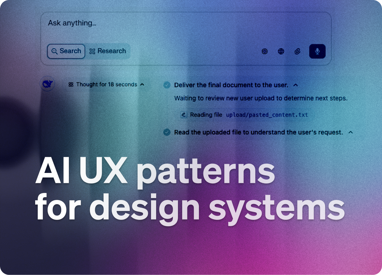
Reflection / Planning Pattern
AI tells you what it's doing or plans to do next.
Status indicators (“Analyzing your request…”)
Show time estimates
Step-by-step plans or summaries to guide and inform you
Option to edit or approve the plan before it runs
(Numbered) steps for complex processes


Showing generated content - artifacts
Output like code, images, and documents.

Clear, readable formats (e.g., syntax highlighting for code, previews for images).
Easy actions: copy, download, export, continue editing.
Label what was generated vs. what was user-created.
Showing changes
Highlighting what the AI changed, added, or deleted.
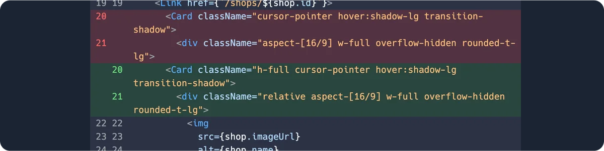
Before/after views + change summaries
Inline highlights (like in code diffs or track changes in docs).
“Undo,” “Accept,” or “Reject” controls.
Ability to revert specific changes
Change history with timestamps
Giving feedback to the AI
Letting users rate or correct the AI's output.
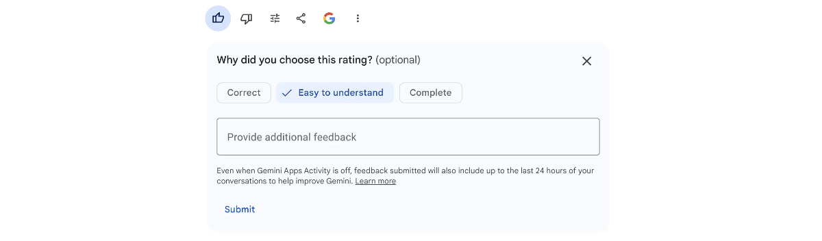
Quick actions: thumbs up/down, “this is wrong,” “improve this.”
Allow freeform feedback (short textbox).
Optional tagging (“inaccurate,” “irrelevant,” etc.).
Quick categorization options for feedback type
Follow-up questions about what could be improved
Visible confirmation that feedback was received
Giving control to the user
Giving users clear influence over the AI.

Show what inputs the AI is using.
Model selection options when multiple AIs are available
Suggestion chips for the next steps
Let users choose the next steps (e.g., “generate more ideas,” “refine this”).
Explain why the AI suggested something (e.g. “Based on your last edit…”).
Cancel buttons for long-running operations
Clear data usage notices
Errors
When something goes wrong.

Plain language error descriptions (“Couldn’t generate a response. Try again.”).
Explain why it failed (rate limits, unsupported prompt, etc.).
Offer next steps (retry, simplify, contact support).
Visual distinction between critical and minor errors
A clear indication of whether user action is needed
Links to relevant documentation
Showing usage
Usage tracking should be transparent and meaningful.

Visual meters showing credit/token consumption (e.g. “This action used 1,000 tokens”).
Usage dashboards (daily/weekly/monthly).
Plain language explanations of token costs
Budget alerts before limits are reached
Clear costs tied to value (“This generation = 2 credits, approx. $0.03”).
Stay tuned for part 2, where I’ll go deeper into agentic patterns, how to prepare design tokens for AI-driven interfaces, and more. ✌️
💎 Community Gems
Figma Variable Modes vs Component Variants
by Mr. Biscuit
🔗 Link
Design audit course by UXCEL in collaboration with me
Join the course and learn how to do the design audit. It’s easy. 😉 ✌️
🔗 Link
Microsoft Fluent 2 Website Update
🔗 Link