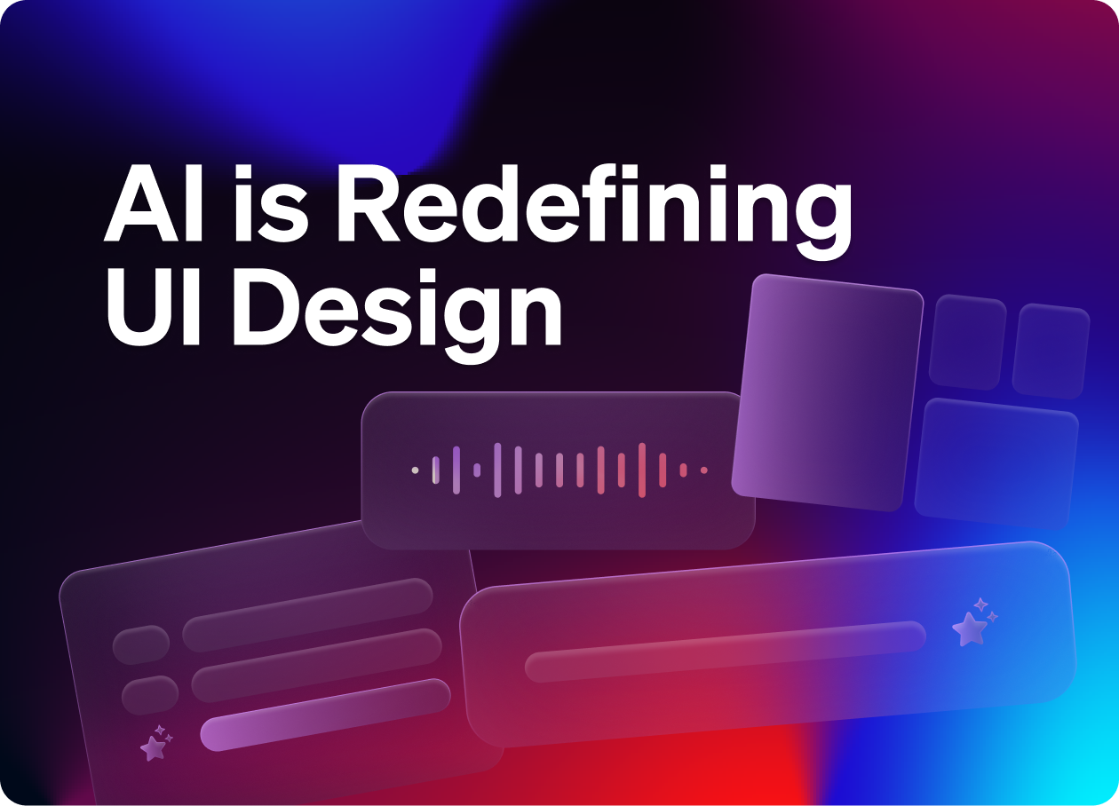
👋 Get weekly insights, tools, and templates to help you build and scale design systems. More: Design Tokens Mastery Course / YouTube / My Linkedin
If you're designing UX today, you’re not just deciding where buttons go. You’re designing systems that remember, infer, and act. Often, before the user does anything.
This is a major shift. And most teams aren’t ready.
In this post, I’ll cover:
What’s changing in interface design because of AI
The new components and patterns
How to prepare your product and design system for what’s next
Let's dive in 👇
1. UI is no longer static
AI is no longer an add-on. It’s the engine driving how interfaces behave.
We’re moving from static screens to systems that:
Adapt in real time
Change layouts based on user intent
Remember past behavior and act on it
The companies leading this shift are the ones with the most data. They can analyze behavior, detect patterns, and deliver adaptive experiences that feel personal and proactive.
Think Notion, Spotify, Google, Figma. These tools improve the more you use them. Or take something more SaaS-focused: Linear, for example, uses recent activity and project context to pre-fill issue fields, auto-prioritize views, and surface relevant docs.
Reality check: This might feel like a decade away, but it is not.
2. Personalization
Personalized interfaces are powerful, but too much adaptation creates confusion. Users don't want to feel like the product is changing out from under them. 🫠
Here’s what helps:
Consistency anchors: Core UI elements that stay the same
Predictable adaptation: Changes follow clear rules
Clear intent previews: Users see what will happen before it happens
Example: Good personalization: Spotify's Discover Weekly
Shows up at the same time every week (predictable timing)
Always in the same place (consistency anchor)
Clear label explaining what it is and why it's there
Users know exactly what to expect
Bad personalization: Randomly shifting navigation
Menu items move based on usage patterns
No explanation for why things changed
Users waste time hunting for features
Creates anxiety about where things will be next time
Reality check: If users can't trust what they'll see when they open your app, they'll stop using it.
3. Memory, what and how?
AI systems are increasingly acting on behalf of the user. They generate, restructure, and automate, sometimes without explicit instruction. This makes memory and transparency critical.
You’re storing decisions and actions the system made.
What to build:
Background memory: Low-stakes preferences like “Always show links in card view.”
Confirmed memory: Higher-stakes insights that the user approves, like “Always auto-accept all the changes.”
Digest view: A daily/weekly summary of what the system learned, remembered, or changed
Memory document: A place to see, edit, or delete stored context and preferences
Action summaries: When AI rewrites or updates something behind the scenes (e.g., Cursor changes code, Copilot restructures a document), show a clear summary of:
What was changed
Why it was changed
What input or context triggered the change
Even simple confirmations like “Updated based on your last prompt” help maintain trust.
Reality check: If the AI is making changes and users don’t know what or why, trust breaks — fast.
4. Forget this context
AI-driven products make assumptions. Sometimes they’re wrong. You need a fast way for users to say: “That’s not what I meant.” Or even go back and update the rules and memory.
A few ways to handle this:
A simple ✖️ or 👎 next to a personalized element
Tap triggers like “Want to fix this?” or “Should I forget this?”
Quick feedback: “Wrong context” leads to updated memory or logic
Reality check: Without a way to course-correct, your AI will drift. And user trust will go with it.
5. Voice is powerful, but invisible
Voice is fast, intuitive, and increasingly common. But it introduces a major UX challenge: once a command is spoken, it disappears.
Users are left wondering:
Did the system hear me?
What did it do with that input?
Can I undo it?
To make voice usable and trustworthy, you need to make the invisible visible.
What to build:
Visual confirmations (“You want me to do XY ✅”)
Voice transcripts so users can see what was heard and recognized
Contextual memory that reminds users what decisions were made earlier
Voice logs users can review, just like a chat history
Multi-modal follow-ups, like tapping to confirm a spoken command
Reality check: If users can’t see what voice is doing, they won’t trust it, and they’ll stop using it.
6. Multi-Modal interactions
Users move between voice, touch, typing, and gesture. Sometimes in the same session. Your UI needs to keep up.
Simple example: clicking versus chat conversation. When you are vibe-coding with Cursor, you can type “accept” or click on “Accept all”. So, what’s faster in this case? :)
Design for:
Voice for quick actions like “Play music” or “Start a timer”
Text for precision like “Summarize this doc”
Gestures for hands-free environments
Multi-modal confirmations where AI speaks and users tap
Visual memory cues like transcripts, context recaps, or voice logs
Reality check: Users expect your product to respond in the most natural way for them, not just how it was originally designed.
7. New component categories
Traditional design systems focus on static visual elements. That’s no longer enough.
What I have in mind?
Suggestion components that offer actions based on context
Memory components that surface past decisions
Intent components that help users express what they want to do
Adaptation components that explain why the UI changed
Example from Replit below:
Reality check: Your components can’t just look good. They need to behave well in dynamic environments.
8. Behavioral design tokens
We already use design tokens for colors, type, and spacing. Now we need them for behavior. Behavioral tokens enable your system to adjust the UI without compromising consistency.
Reality check: Without a way to codify behavior, personalization becomes chaos.
9. Context layer
The UI shouldn't treat every moment the same. Planning, reviewing, and executing all need different information hierarchies, even if the components stay the same.
Example: Project management interface
Planning mode:
Timeline view is prominent
Resource allocation tools are highlighted
Recent decisions widget shows planning history
Quick actions focus on "Add milestone" and "Assign tasks"
Execution mode:
Task lists dominate the layout
Progress indicators are focused
Recent decisions widget shows blockers and updates
Quick actions focus on "Mark complete" and "Update status"
Review mode:
Analytics and reports take priority
Comparison views are easily accessible
Recent decisions widget shows key outcomes
Quick actions focus on "Export report" and "Schedule next review"
Same components, same data, but the interface reorganizes based on what you're trying to accomplish.
What this requires:
A layer that understands user mode, state, and environment
Components that respond to that context
Layouts that shift without breaking mental models
Reality check: Without a context layer, your interface can't adapt in meaningful ways. It can only guess.
10. Versioning
How do you debug a UI that adapts in real time? How do you track what a user saw when something broke?
You’ll need:
Automatic state snapshots to capture what the UI looked like at any moment
Versioned logic to track which adaptation rules were in play
Change logs to help users and teams understand what changed and why
Reality check: Without visibility into UI state and behavior, personalization is impossible to maintain or support.
What You Can Do Now 👇
Track how people use your components
Start collecting usage data now, even if you’re not personalizing yet.Design for flexible states
Assume your components will need to adjust for context, skill level, and prominence. Add metadata.Add explainability hooks
Every component should be able to answer “Why do I look like this right now?”Define boundaries
Decide what must remain stable so users don’t feel lost.Start testing behavioral tokens
Codify dynamic behavior just like you do for color and spacing.
Enjoy exploring. ✌️
— If you enjoyed this post, please tap the Like button below 💛 Thank you.
💎 Community Gems
Kiro - The AI IDE for prototype to production from Amazon
*Launched this week
🔗 Link
Summer AI inspiration links for designers
🔗 Link
I don’t think that this is AI redefining it to be honest. These are ongoing heuristics in UX and interfaces that were developed way before AI. What would you think that outside those AI is really redefined?
How would behavioral tokens be like? 🤔